Volume Table Widget
What It Controls
The Volume table widget is the tier table customers see on the product page when you run a Volume Discount offer. It shows each quantity tier with the discount, savings, and a checkbox so customers can pick the tier they want.
The styling you set here applies to every Volume Discount offer in your store.
How to Open It
In AOV.ai Bundle Upsell, click Widget display in the left sidebar, then click Setup on the Volume table card.
What You Can Customize
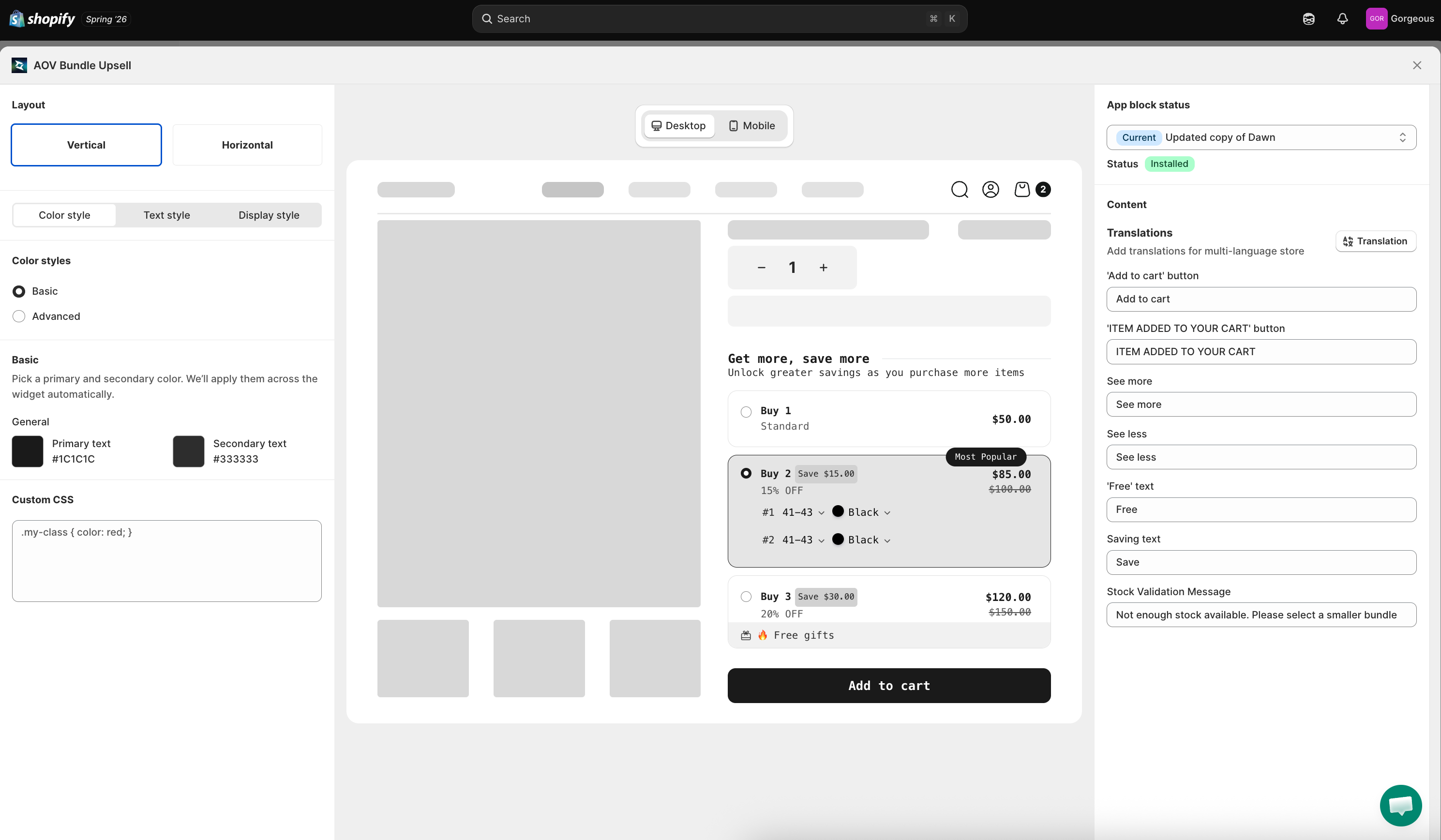
Layout
Choose how the tier list is arranged on the product page:
- Vertical: tiers stacked top to bottom (default; works in tight product page layouts)
- Horizontal: tiers shown side by side (works when you have more product page width)
- Table: each tier renders as one row in a table (quantity, save, price columns), so a long tier ladder stays scannable in one screen instead of stretching down the page. Best for wholesale-style offers with many tiers (8 to 10 or more).
Sync Theme Color
If your theme is compatible, click Sync theme color to auto-match the widget's colors to your Shopify theme. If the button is locked, your theme has a conflict. Click Check my theme to start the unlock review.
The rest of the left column is split into three tabs: Color style, Text style, and Display style.
Color Style Tab
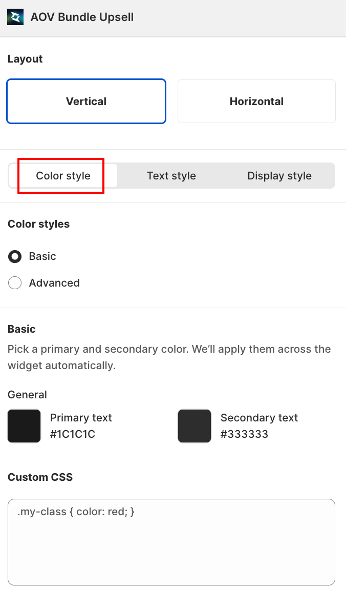
Two modes:
- Basic: pick a primary and secondary color, and the app applies them across the widget automatically.
- Primary text: default
#1C1C1C - Secondary text: default
#333333
- Primary text: default
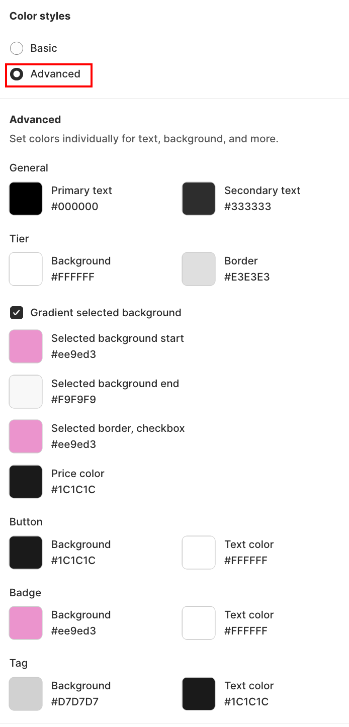
- Advanced: switch to Advanced for granular control over individual element colors (header, badge, border, etc.)
Text Style Tab
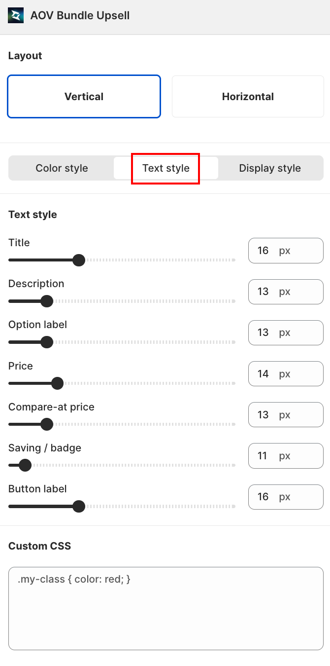
A slider + number field (10px to 30px) for each text element, so you can resize any piece of copy independently:
| Field | Controls |
|---|---|
| Title | The widget's main heading |
| Description | Supporting text under the title |
| Option label | Label on each quantity tier's radio option |
| Price | The tier's discounted price |
| Compare-at price | The struck-through original price |
| Saving / badge | The savings badge text (e.g. "Save 10%") |
| Button label | The Add to cart button text |
Display Style Tab
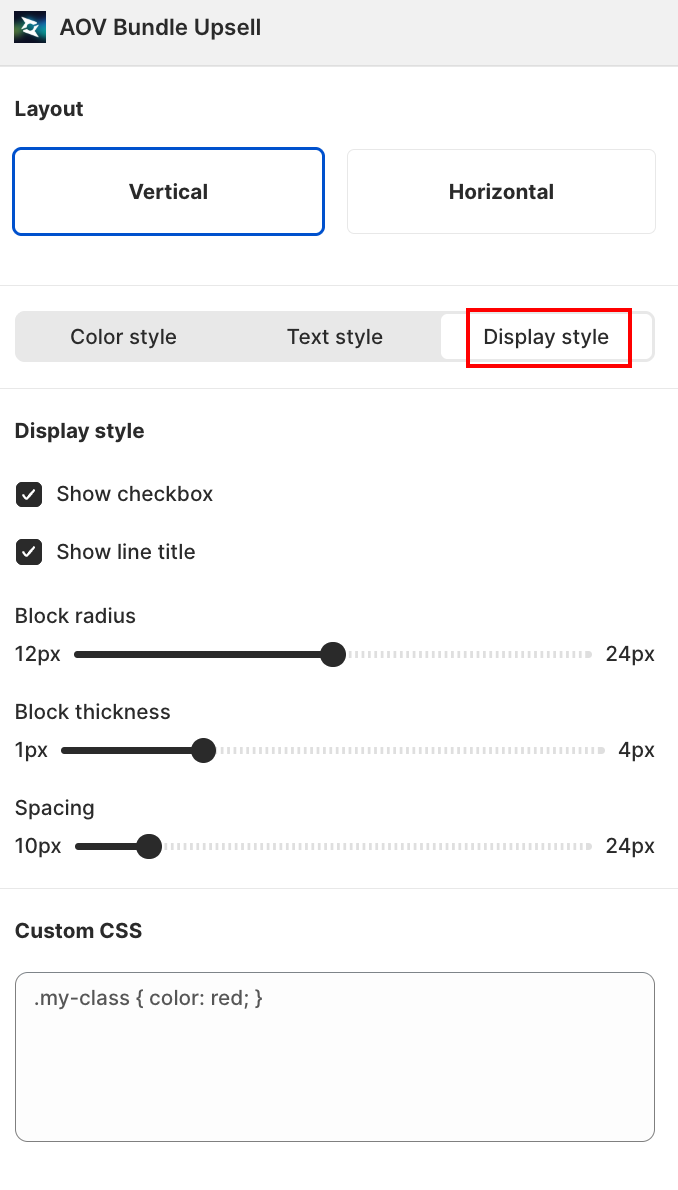
Toggle visual elements on or off:
- Show checkbox: show a radio/check next to each tier so customers can pick visually.
- Show line title: show the tier title label (Tier 1, Tier 2, etc.)
Plus three sliders for the tier blocks themselves:
| Field | Range | Controls |
|---|---|---|
| Block radius | 0px to 24px | Rounded corners on the tier blocks. Sharper for modern minimal themes, more rounded for a friendly feel |
| Block thickness | 0px to 4px | Border thickness around each tier block |
| Spacing | 8px to 24px | Gap between tier blocks |
Content (Right Column)
Customize the text labels customers see:
| Field | Default | Where it appears |
|---|---|---|
'Add to cart' button | Add to cart | The CTA button below the tier list |
'ITEM ADDED TO YOUR CART' button | ITEM ADDED TO YOUR CART | Confirmation state after the customer adds the bundle |
See more | See more | Link to expand long tier lists |
See less | See less | Link to collapse the tier list |
'Free' text | Free | Used for free gifts attached to a tier |
Saving text | Save | Prefix on each tier's savings label |
Stock Validation Message | Not enough stock available. Please select a... | Shown when a tier requires more inventory than available |
Live Preview
The center column shows the widget rendered on a mock product page. Use the Desktop / Mobile toggle (top of preview) to see how it looks on each screen size before you save.
Save
Changes save automatically as you edit. Close the modal with the X in the top-right when you're done. Switch back to the Offer page or your storefront to see the changes applied across every Volume Discount offer.
Related
- Volume Discount how to set up: for the offer-level data (products, tiers, schedule)
- Volume Discount Templates: for picking the starting layout
- Sync theme color: how the auto-match feature works
- App Embed and Theme Integration: if the widget isn't appearing on your storefront