Widget Display Overview
What Is the Widget Display Section?
Widget display is a top-level section in the AOV.ai Bundle Upsell app where you customize the look and feel of every bundle widget on your storefront. Set the styles once per widget type, and they apply to every offer of that type.
This is separate from each individual offer's settings (Step 1: Offer setting), which control what the offer does (which products, what discount, when it runs). Widget display controls how it looks (colors, layout, labels, button text).
When to Use It
Open Widget display when you want to:
- Match widget colors to your theme
- Change the layout style (grid vs. list, classic vs. card slider)
- Customize button labels (Add to cart text, "Save" text)
- Update strings shown to customers (in your store's voice)
You don't need to come here for routine offer changes (price, products, schedule). Those live in the Offer page.
How to Open It
From the Shopify admin, open AOV.ai Bundle Upsell in the left sidebar. Click Widget display.
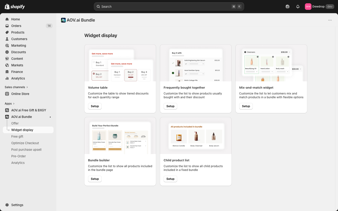
You'll see 6 widget cards. Each card opens a setup modal for that widget.
The 6 Widgets
| Widget | Used by which offer type | What it controls |
|---|---|---|
| Volume table | Volume Discount | The tier table customers see on the product page |
| Frequently bought together | FBT offers | The "Buy it with" suggestion list |
| Mix-and-match | Mix & Match Bundle | The flexible bundle builder UI with options |
| Bundle builder | Bundle Builder | The grid of selectable products + bundle summary |
| Child product list | Product Fixed Bundle | The "products included in bundle" list shown on the bundle's product page |
| Product recommendation | Product Recommendation | The "you might also like" list on the product page |
Click Setup on any card to open that widget's customization modal.
Anatomy of a Widget Setup Screen
Every widget setup opens a full-screen modal with three columns:
- Left column: configuration. Layout, colors, display options, block radius.
- Center column: live preview with a Desktop / Mobile toggle, so you can see how the widget renders at different screen sizes.
- Right column: app block status (whether the widget is installed in your theme) and Content (text labels).
Most widgets also have a Sync theme color card near the top of the left column. It's a paid feature that auto-matches widget colors to your Shopify theme. If your theme has a conflict, the button is locked and you'll see "Feature locked due to theme conflict. Check my theme to unlock."
How Widget Styles Relate to Offers
One widget setup applies to all offers of that type. Change the Volume table widget's colors once, and every Volume Discount offer in your store picks up the new colors. No more updating the same color across seven different offers.
An offer's individual Step 2: Display setting (inside each offer's wizard) controls per-offer presentation choices like layout direction and the redirect after Add to cart. The shared widget styling lives here in Widget display.
Before Customizing a Widget
Each widget needs an app block enabled in your theme to render on the storefront. Inside the widget setup, the right-side App block status card shows whether the block is currently installed:
- Status: Not installed: click Add block to open Shopify's theme editor and enable the block.
- Status: Installed: you're good to go.
For the full theme integration walkthrough, see App Embed and Theme Integration.
Next
Pick a widget to customize:
- Volume table widget: for Volume Discount offers
- Frequently bought together widget: for FBT offers
- Bundle builder widget: for Bundle Builder offers
- Mix-and-match widget: for Mix & Match offers
- Child product list widget: for Product Fixed Bundle offers
- Product recommendation widget: for Product Recommendation offers