Mix-and-Match Widget
What It Controls
The Mix-and-match widget is the flexible bundle UI that lets customers build their own pack from a set of options you define. Each option presents variant pickers (size, color, scent, etc.) so customers customize each bundle slot. The styling here applies to every Mix & Match Bundle offer in your store.
How to Open It
In AOV.ai Bundle Upsell, click Widget display in the left sidebar, then click Setup on the Mix-and-match widget card.
What You Can Customize
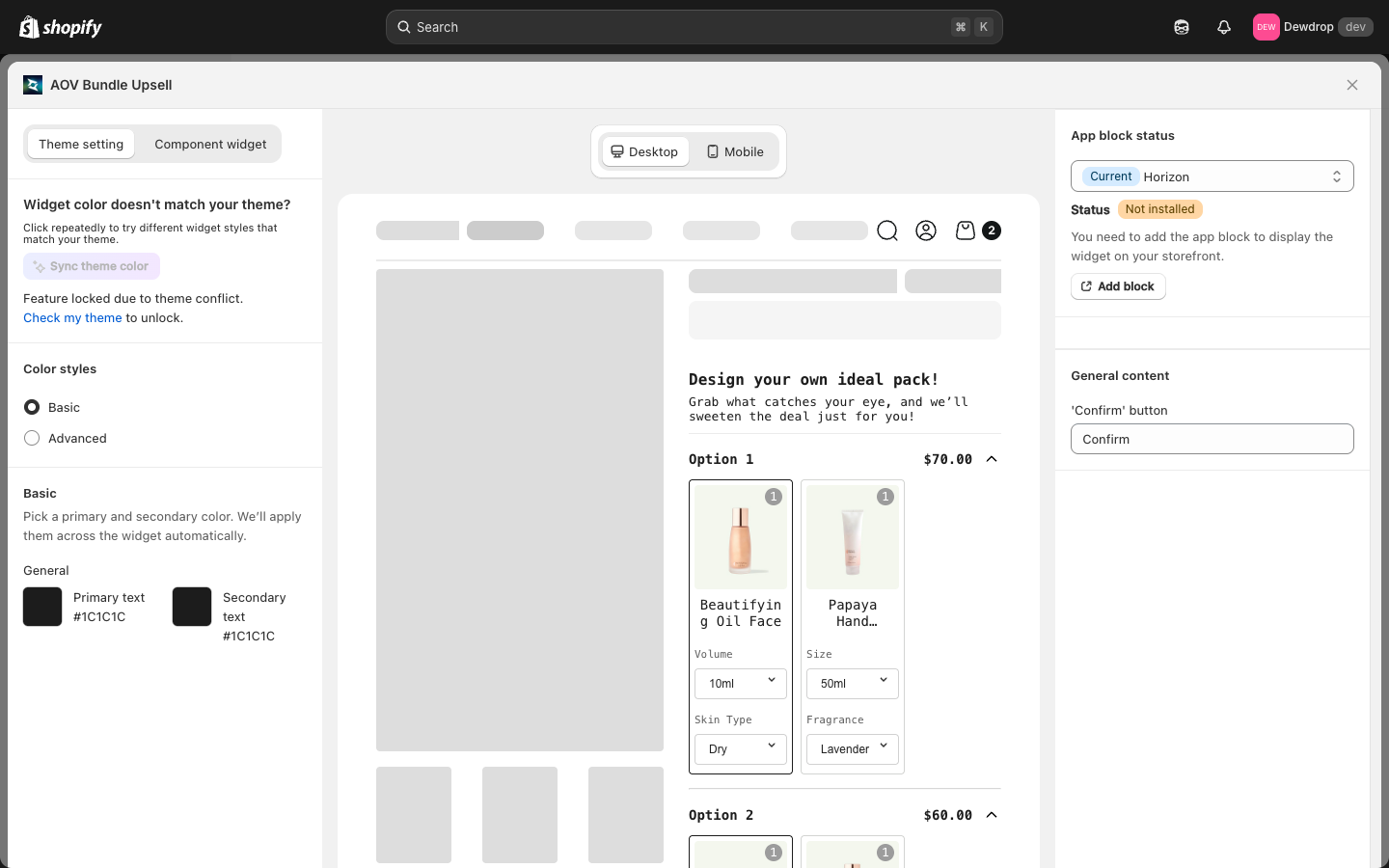
The setup modal has two top tabs:
- Theme setting: colors and visual styling (default tab)
- Component widget: sub-widget configuration for individual bundle options
Theme Setting Tab
Sync theme color
Auto-match widget colors to your Shopify theme. If it's locked due to a theme conflict, click Check my theme to start the unlock review.
Color styles
- Basic: pick a primary and secondary color.
- Primary text: default
#1C1C1C - Secondary text: default
#1C1C1C
- Primary text: default
- Advanced: granular per-element control.
The Mix-and-match widget has a leaner color palette than other widgets. Most visual elements (variant dropdowns, option cards) inherit their colors from the customer's Shopify theme automatically, so there's less to override.
Content (Right Column)
| Field | Default | Where it appears |
|---|---|---|
'Confirm' button | Confirm | CTA when the customer has filled all bundle options |
Why so few labels? The Mix-and-match widget intentionally relies on the customer's own product data (option names, variant names) for its UI rather than fixed strings.
Component Widget Tab
The second tab opens the per-option sub-widget styling. Use this to fine-tune how each individual option block looks (the box that contains a single option's variant pickers).
Live Preview
The center column shows a complete Mix-and-match widget rendered on a mock product page:
- Design your own ideal pack! header
- A friendly subtitle: "Grab what catches your eye, and we'll sweeten the deal just for you!"
- Multiple Option rows, each with a price, expand/collapse caret, and product cards
- Each product card has its variant pickers (e.g., Volume dropdown, Skin Type dropdown, Fragrance dropdown)
Toggle Desktop / Mobile to verify both screen sizes.
How Customers Use the Widget
Each option in the bundle represents a "slot" the customer fills. For a Build Your 3-Pack skincare bundle:
- Option 1: customer picks a serum + variant (Volume: 10ml, Skin Type: Dry)
- Option 2: customer picks a moisturizer + variant
- Option 3: customer picks a cleanser + variant
When all 3 options are filled, the Confirm button activates and the bundle adds to cart with the configured discount.
Save
Changes save automatically. Close the modal with the X in the top-right when you're finished.
Related
- Mix & Match Bundle how to set up: for the offer-level data (which options, which products, what discount)
- Sync theme color: how auto-match works
- App Embed and Theme Integration: if the widget isn't rendering