Trust Badges
Display trust signals at checkout — security badges, policy icons, and payment method logos. Trust Badges help reassure buyers that their checkout is safe and their preferred payment methods are accepted, reducing cart abandonment.
Requires Shopify Plus. Trust Badges uses Checkout UI Extensions, which are available on Shopify Plus plans.
What it does
Trust Badges displays customizable trust signals at your Shopify checkout. Choose from two badge types:
- Icon Block — icon + text badges with 75 built-in checkout icons, 6 color tones, and custom image support. Show security seals, return policies, shipping guarantees — anything that builds buyer confidence.
- Payment Icons — payment method logos (Visa, Mastercard, PayPal, Klarna, and 800+ more). Buyers see familiar payment brands and feel confident entering their payment info.
Each trust badge config gets a unique Widget ID. You enter this ID in the Theme Editor when adding a Trust Badges block — linking the block to the correct config.
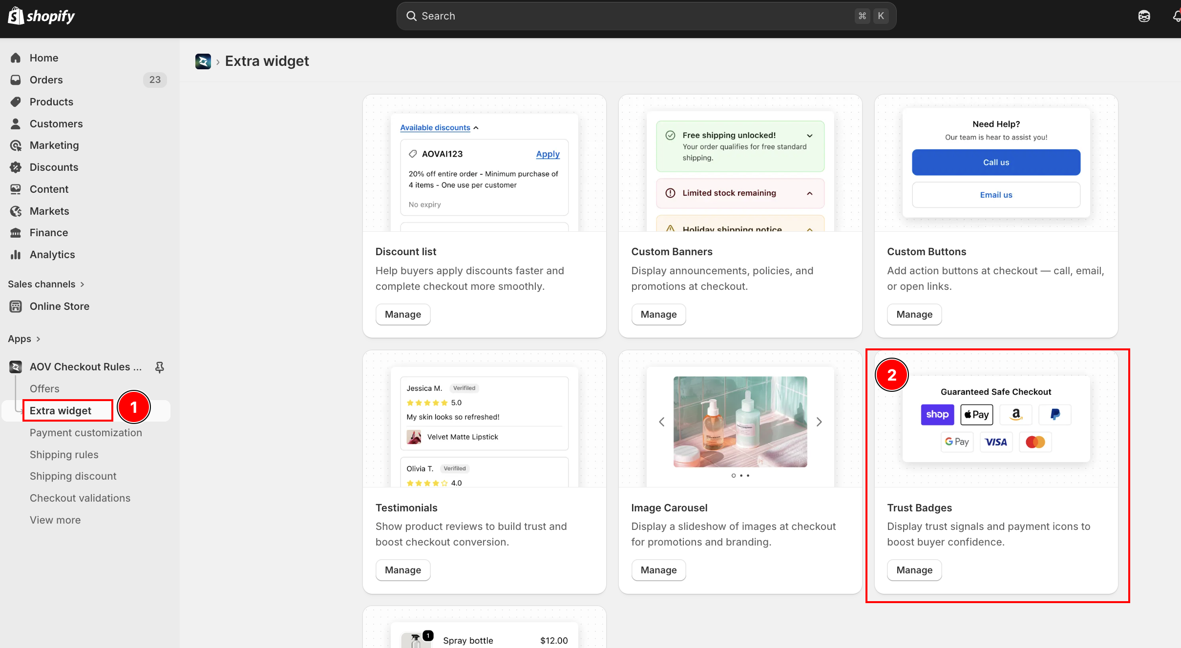
Step 1: Go to Extra Widgets
In the app sidebar, click Extra Widgets. Find the Trust Badges card and click Manage.
List page overview
The list page shows all your trust badge configs. Each config is either an Icon Block or Payment Icons setup.
| Column | Description |
|---|---|
| Widget ID | Auto-generated unique ID (e.g., badge_5r2t) — copy and use in Theme Editor |
| Name | Config name for your reference (not shown to buyers) |
| Type | Icon Block or Payment Icons |
| Status | Active (live at checkout) or Expired (hidden) |
| Created | Date the config was created |
| Actions | Activate/Deactivate, Edit, Delete |
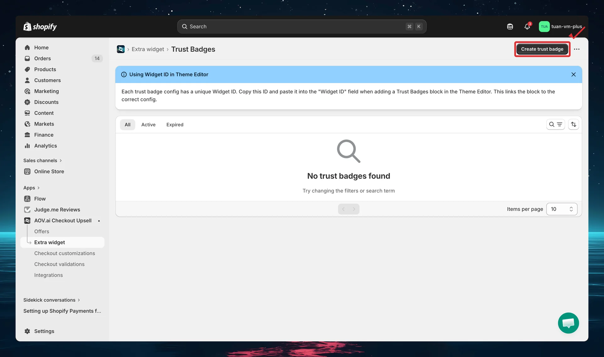
You can select multiple configs and use bulk actions to activate, deactivate, or delete them at once.
Each trust badge config has a unique Widget ID. Copy this ID and paste it into the "Widget ID" field when adding a Trust Badges block in the Theme Editor. This links the block to the correct config.
Step 2: Create a new trust badge
Click Create trust badge (top right). The editor opens with a two-column layout: settings on the left and sidebar + live preview on the right.
Choose badge type
The first thing you see is the Badge type selector — two visual cards side by side:
| Option | Description |
|---|---|
| Icon Block | Icon + text badges — customize icon, color, title, and description for each badge |
| Payment Icons | Payment method logos — select from 800+ payment icons, add custom images |
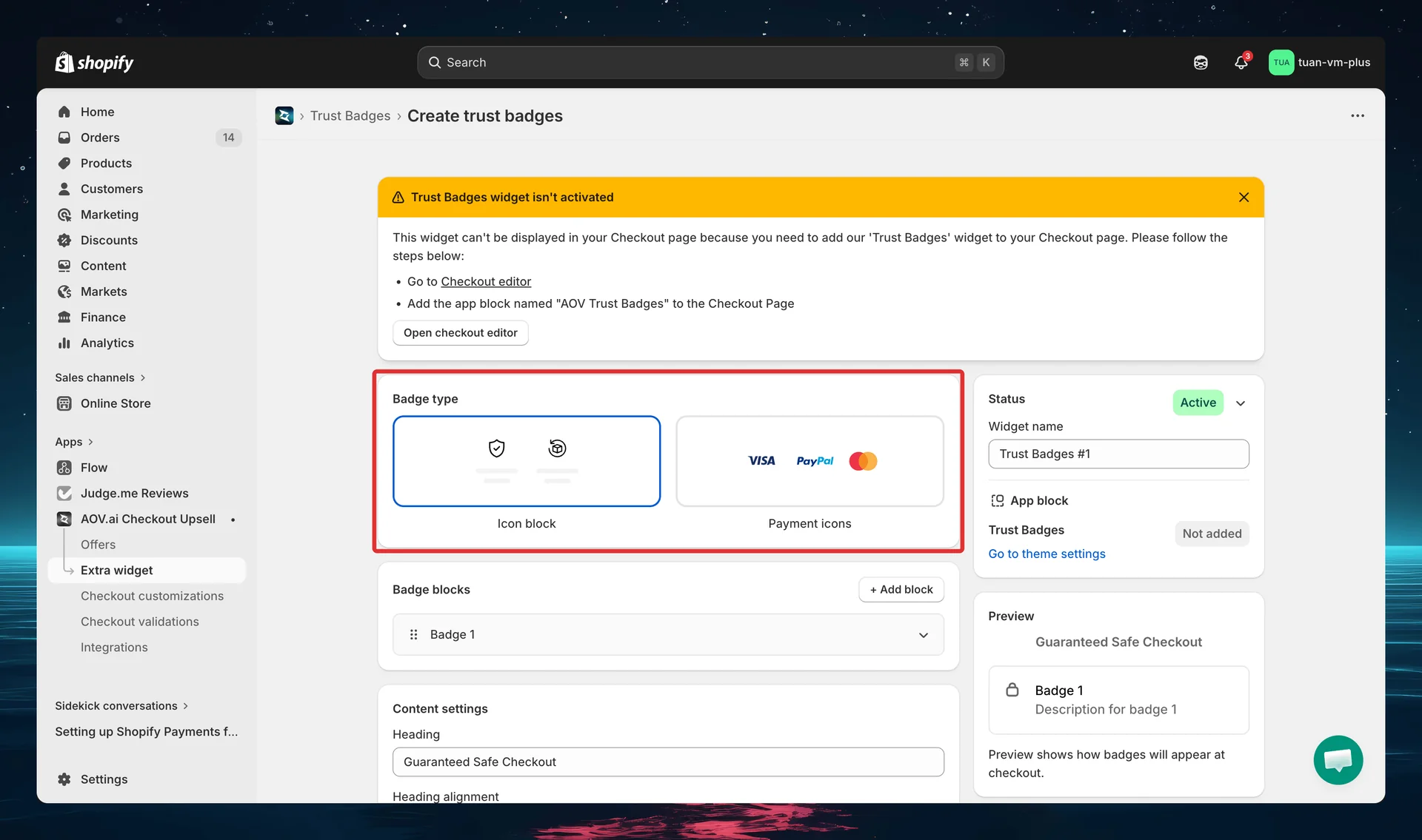
Click a card to select that type. The selected card gets a blue border. You can change the type at any time — even after saving.
Step 3A: Configure Icon Block
If you selected Icon Block, the editor shows the Badge blocks section. Each badge has an icon, icon color, an optional custom image, a title (with style + color), and a description (with style + color).
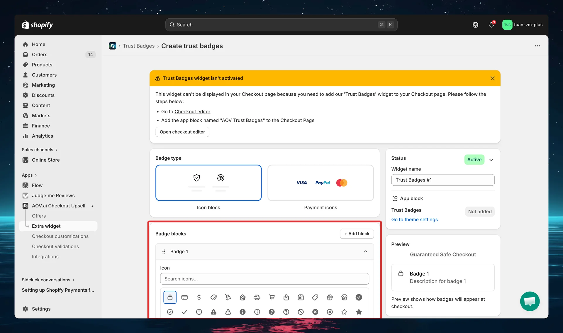
Adding badges
Click + Add block to add a new badge. Each badge appears as an expandable section labeled Badge 1, Badge 2, etc., with:
- Drag handle — drag to reorder badges
- Badge label — "Badge 1", "Badge 2", etc. (just the section header — the visible text comes from the Title field below)
- Delete button — remove the badge (only shown when there's more than one badge)
- Expand/collapse — click the header to toggle
There's no limit on the number of badges per config. New badges default to a "Badge N" title and a "Description for badge N" description.
Per-badge settings
For each badge, configure:
Icon picker
A visual grid of 75 Shopify Checkout icons drawn from categories such as Security, Delivery, Shopping, and Status. The grid is a single searchable list — type in the "Search icons…" field to filter by name, then click any icon to select it.
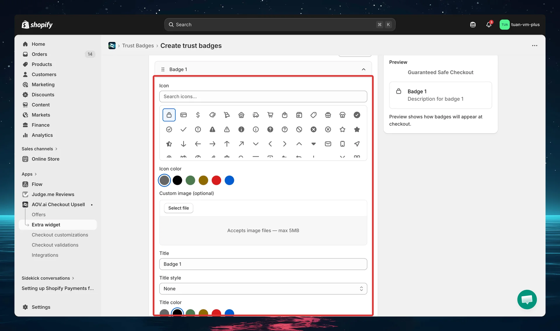
Popular icons include: lock, credit-card, delivery, truck, cart, check-circle, savings, gift-card, globe, and shield.
Icon color
Choose from 6 color tones displayed as circular swatches:
| Swatch label | Color | Hex |
|---|---|---|
| neutral | Gray | #666666 |
| black | Black | #000000 |
| green | Dark green | #4D7A50 |
| yellow | Dark yellow | #8F6900 |
| red | Red | #D91C1C |
| blue | Brand blue | #005BD1 |
The selected swatch gets a blue ring highlight. These colors match the Shopify checkout icon tones.
Custom image (optional)
Below the icon color, a Custom image (optional) uploader lets you use your own image instead of a built-in icon (PNG, JPG, SVG, WebP — max 2MB).
Title, Title style & Title color
| Field | Options / Type | Default | Description |
|---|---|---|---|
| Title | Free text | "Badge N" | Main badge text (e.g. "Secure Checkout") |
| Title style | None / Italic | None | Styling applied to the title text |
| Title color | swatch (grey / black / green / yellow / red / blue) | black | Color of the title text |
Description, Description style & Description color
| Field | Options / Type | Default | Description |
|---|---|---|---|
| Description | Free text | "Description for badge N" | Secondary text below the title (e.g. "SSL encrypted") |
| Description style | None / Italic | None | Styling applied to the description text |
| Description color | swatch (grey / black / green / yellow / red / blue) | grey | Color of the description text |
Text length tip: Keep titles under 25–30 characters (vertical) or 15–20 characters (horizontal) to avoid layout issues. Descriptions should be under 40–50 characters (vertical) or 20–25 characters (horizontal).
Step 3B: Configure Payment Icons
If you selected Payment Icons, the editor shows a searchable grid of payment method logos.
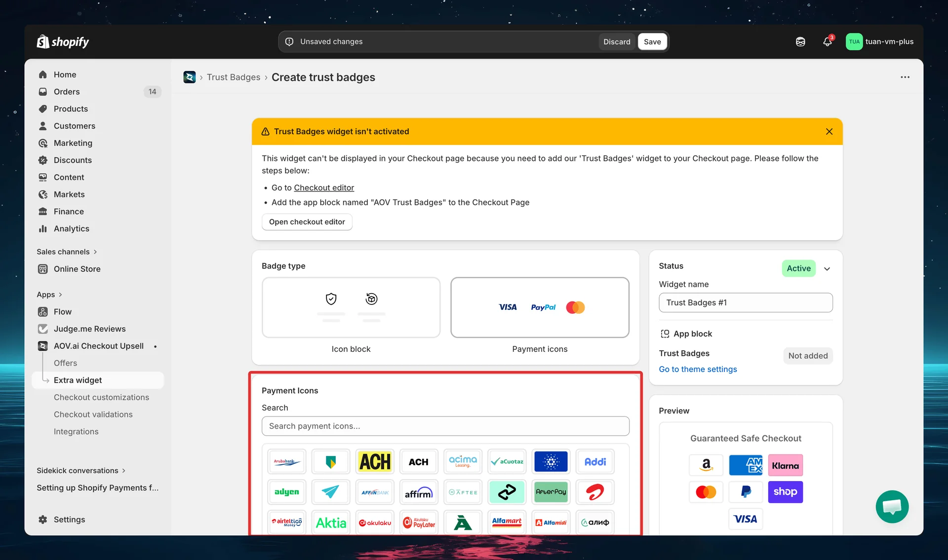
Selecting payment icons
- Search — type in the "Search payment icons…" field to filter icons by name (e.g., "visa", "klarna", "apple")
- Browse the grid — scroll through all 800+ payment icons displayed as image cards (57x36px each)
- Click to select/deselect — selected icons show a highlighted border with a checkmark
Default selection (pre-selected when creating a new config):
- Visa, Mastercard, American Express
- PayPal, Amazon, Shop Pay
- Klarna
Available payment icons
The app includes 800+ payment method icons covering:
| Category | Examples |
|---|---|
| Cards | Visa, Mastercard, Amex, Discover, JCB, UnionPay, Maestro |
| Digital Wallets | Apple Pay, Google Pay, Shop Pay, PayPal, Samsung Pay, Amazon, Venmo |
| Buy Now Pay Later | Klarna, Afterpay, Affirm, Zip, Sezzle, Tabby |
| Bank Transfers | iDEAL, Bancontact, Sofort, SEPA, Trustly, PIX, Interac |
| Mobile Money | GoPay, GrabPay, GCash, ShopeePay, Momo, Paytm |
| Crypto | Bitcoin, Ethereum, Litecoin, USDC, Solana |
| Regional | M-Pesa, Boleto, OXXO, Mercado Pago, Mada, KNET |
Custom images
Below the payment icon grid, in the Custom Images section, you can upload custom payment images for methods not included in the built-in library.
- Click + Upload image to open the upload modal
- Supported formats: PNG, JPG, SVG, WebP (max 2MB)
- You can select/upload multiple images at once
- Maximum: 10 custom images per config — a counter below the grid shows "X of 10 custom images"
- Each uploaded image shows in the custom grid with a delete (✕) control
- Custom images appear after the built-in icons at checkout
The + Upload image button is disabled once you reach 10 custom images. Delete an existing custom image (✕) to free up a slot.
Step 4: Design settings (Icon Block only)
These settings control the visual layout of your Icon Block badges at checkout. They only appear when the badge type is Icon Block.
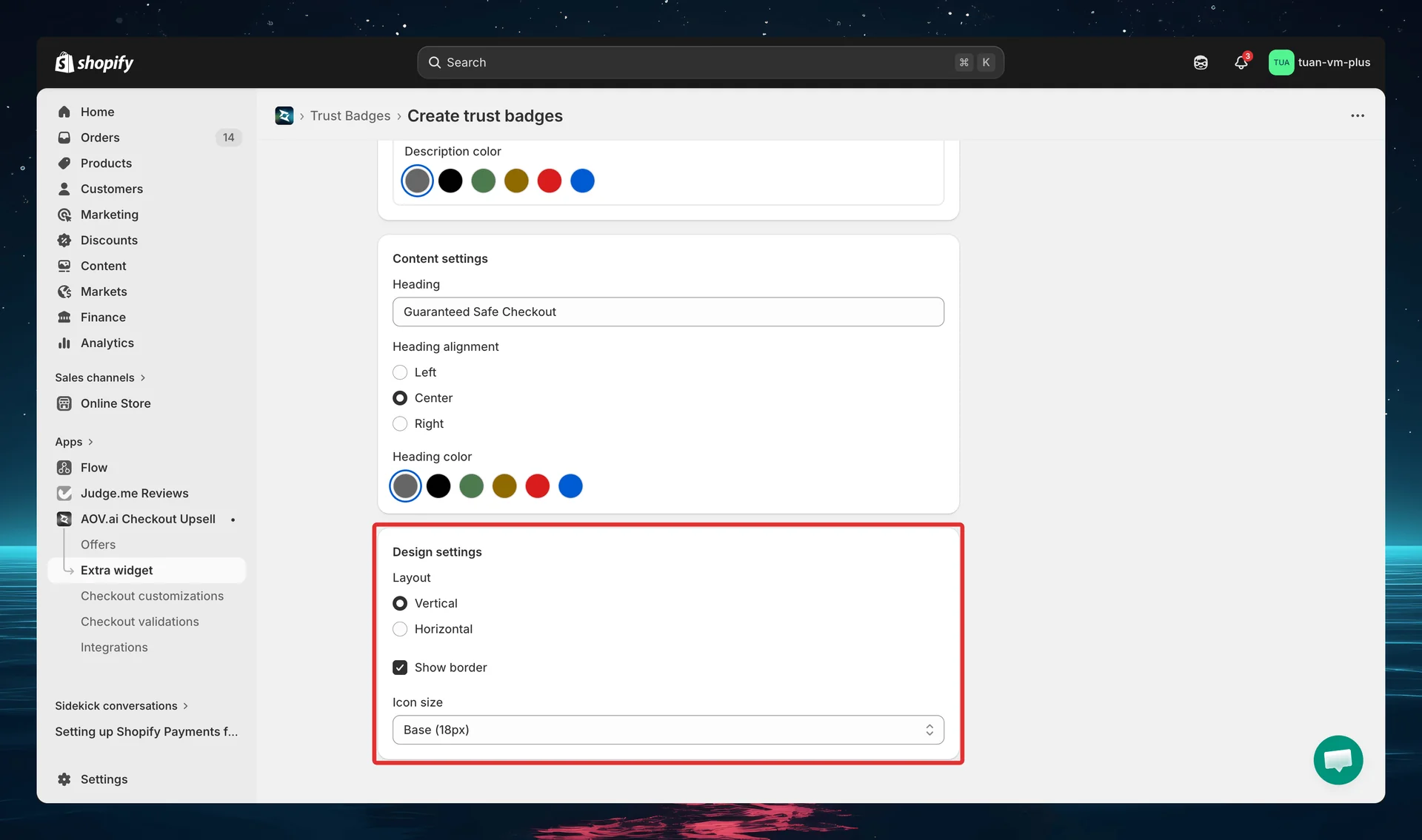
| Setting | Options | Default | Description |
|---|---|---|---|
| Layout | Vertical / Horizontal | Vertical | Vertical: icon left, text right (list). Horizontal: icon top, text bottom (cards in grid) |
| Badges per row | 2 / 3 | 2 | Only shown when layout is Horizontal. Controls how many badge cards per row |
| Show border | On / Off | On | Adds a border around each badge |
| Icon size | Extra Small (10px) / Small (14px) / Base (18px) / Large (24px) | Base (18px) | Size of the badge icon |
Vertical vs Horizontal: Use Vertical for sidebar placement or when you have many badges. Use Horizontal for a compact grid in the main content area. Horizontal layout in the sidebar is not recommended — cards become too narrow.
Step 5: Content settings
Content settings control the heading above your badges and (for Payment Icons) the badge size.
Icon Block content
| Setting | Options | Default |
|---|---|---|
| Heading | Text (optional) | "Guaranteed Safe Checkout" |
| Heading alignment | Left / Center / Right | Center |
| Heading color | swatch: grey / black / green / yellow / red / blue | grey |
Heading color is a row of color swatches (the same six tones used for badge text). If the heading is left empty, no heading is displayed at checkout.
Payment Icons content
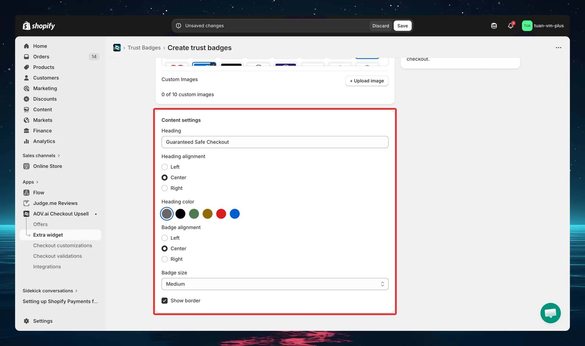
| Setting | Options | Default |
|---|---|---|
| Heading | Text | "Guaranteed Safe Checkout" |
| Heading alignment | Left / Center / Right | Center |
| Heading color | swatch: grey / black / green / yellow / red / blue | grey |
| Badge alignment | Left / Center / Right | Center |
| Badge size | Small / Medium / Large | Medium |
| Show border | On / Off | On |
Badge size controls the payment icon dimensions at checkout:
- Small — 38x24px
- Medium — 57x36px
- Large — 76x48px
Badge alignment controls how the row of payment icons is justified (left, centered, or right). Show border adds a border around the payment icon row.
Step 6: Sidebar settings
The right column of the editor shows the sidebar with shared settings and a live preview.
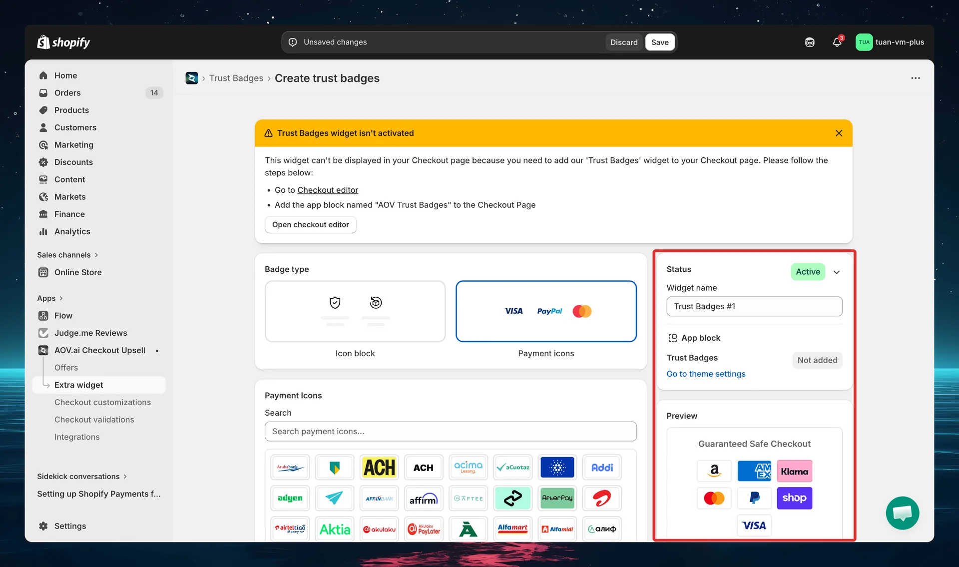
| Section | Description |
|---|---|
| Status | Toggle between Active (live at checkout) and Expired (hidden) |
| Widget ID | Auto-generated after first save (e.g., badge_5r2t). Click the copy button to copy. Enter this ID in the Theme Editor |
| Widget name | Name for your reference — not shown to buyers (e.g., "Store Policies", "Payment Methods") |
| App block | Shows whether the Trust Badges block has been added in the Theme Editor. Click "Go to theme settings" to open the Theme Editor directly |
| Preview | Live preview showing how your badges will look at checkout. Updates in real-time as you change settings |
The Widget ID is generated after you save for the first time. You'll need this ID in the next step.
Step 7: Add the block in Theme Editor
After saving your trust badge config in the app, add it to your checkout page:
- Go to Shopify Admin → Online Store → Customize
- Navigate to the Checkout page in the theme editor
- Click Add block → select AOV Trust Badges
- In the block settings, enter the Widget ID you copied from the app
- Position the block where you want it (main content area or Order Summary sidebar)
- Click Save in the theme editor
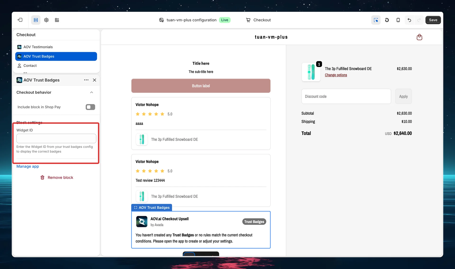
You can add multiple Trust Badges blocks — each with a different Widget ID — to display different badge configs at different positions on the checkout page.
If the Widget ID is invalid or doesn't match any config, the block will be hidden at checkout — it won't break the checkout page.
Tips
Icon Block
- Use Vertical layout for sidebar — horizontal badge cards are too narrow in the Order Summary column (~380px)
- Keep text short — titles under 25 characters (vertical) or 15 characters (horizontal) to avoid wrapping
- Use 3 badges per row for horizontal — balances readability and space
- Enable borders — they give each badge visual separation and look more professional
- Use neutral or black tone for a clean, professional look; use colored tones to draw attention to specific badges
Payment Icons
- Start with the defaults — Visa, Mastercard, American Express, PayPal, Amazon, Shop Pay, Klarna covers most merchants
- Use "Guaranteed Safe Checkout" heading — it's the most recognizable trust signal for buyers
- Small badge size works best — keeps the icon row compact without overwhelming the checkout
- Upload custom icons for regional payment methods your buyers use (e.g., Momo, ZaloPay for Vietnam)
General
- Create multiple configs — one for trust/security badges (Icon Block) and one for payment methods (Payment Icons), then place them in different positions at checkout
- Test on mobile — preview your checkout on mobile to make sure badges look good on smaller screens
- Use the live preview — the sidebar preview updates in real-time, so experiment with different settings before saving
FAQs
General
Q: Do I need Shopify Plus for Trust Badges? A: Yes. Trust Badges uses Checkout UI Extensions, which require Shopify Plus.
Q: Can I create multiple trust badge configs? A: Yes. Create as many configs as you need — each gets its own Widget ID. Add multiple Trust Badges blocks in the Theme Editor, each linked to a different config.
Q: What happens if I deactivate a trust badge? A: It stops appearing at checkout immediately. The config is preserved — you can reactivate it anytime.
Q: Can I use both Icon Block and Payment Icons on the same checkout page? A: Yes. Create one config for each type, then add two separate Trust Badges blocks in the Theme Editor with their respective Widget IDs.
Icon Block
Q: How many badges can I add to one Icon Block? A: There's no hard limit. However, we recommend 3–5 badges for the best visual impact. Too many badges can clutter the checkout.
Q: Can I use my own images instead of the built-in icons? A: Yes. In the icon picker for each badge, select the custom image upload option at the bottom of the icon grid. Supported formats: PNG, JPG, SVG, WebP (max 2MB).
Q: What's the difference between Vertical and Horizontal layout? A: Vertical shows badges as a list (icon left, text right) — best for sidebar or many badges. Horizontal shows badges as a card grid (icon top, text bottom) — best for the main content area with 2–4 badges.
Payment Icons
Q: How many payment icons can I select? A: There's no limit on built-in icons. For custom images, the maximum is 10 per config.
Q: Are the payment icons real logos? A: Yes. All 800+ icons are real payment-brand logos hosted on our CDN. They render as high-quality images at checkout.
Q: What if my payment method isn't in the list? A: Upload a custom image using the + Upload image button in the Custom Images section. Enter a label for the image and upload a PNG, JPG, SVG, or WebP file (max 2MB).
Q: What does the "Contact us" banner mean? A: If you need a specific payment icon added to the built-in library (instead of uploading a custom image), contact our support team and we'll add it for free.
Theme Editor
Q: Where should I place the Trust Badges block? A: Common placements: below the payment form (main content area) for security badges, or in the Order Summary sidebar for payment icons. Experiment with different positions to see what works best.
Q: Can I add the same Widget ID to multiple blocks? A: Yes, but it will show the same config in multiple places. For different content at different positions, create separate configs with different Widget IDs.
Q: The block shows a placeholder message instead of my badges — why? A: This means the Widget ID doesn't match any active config, or you haven't created any trust badges yet. Open the app, create a config, copy the Widget ID, and enter it in the block settings.