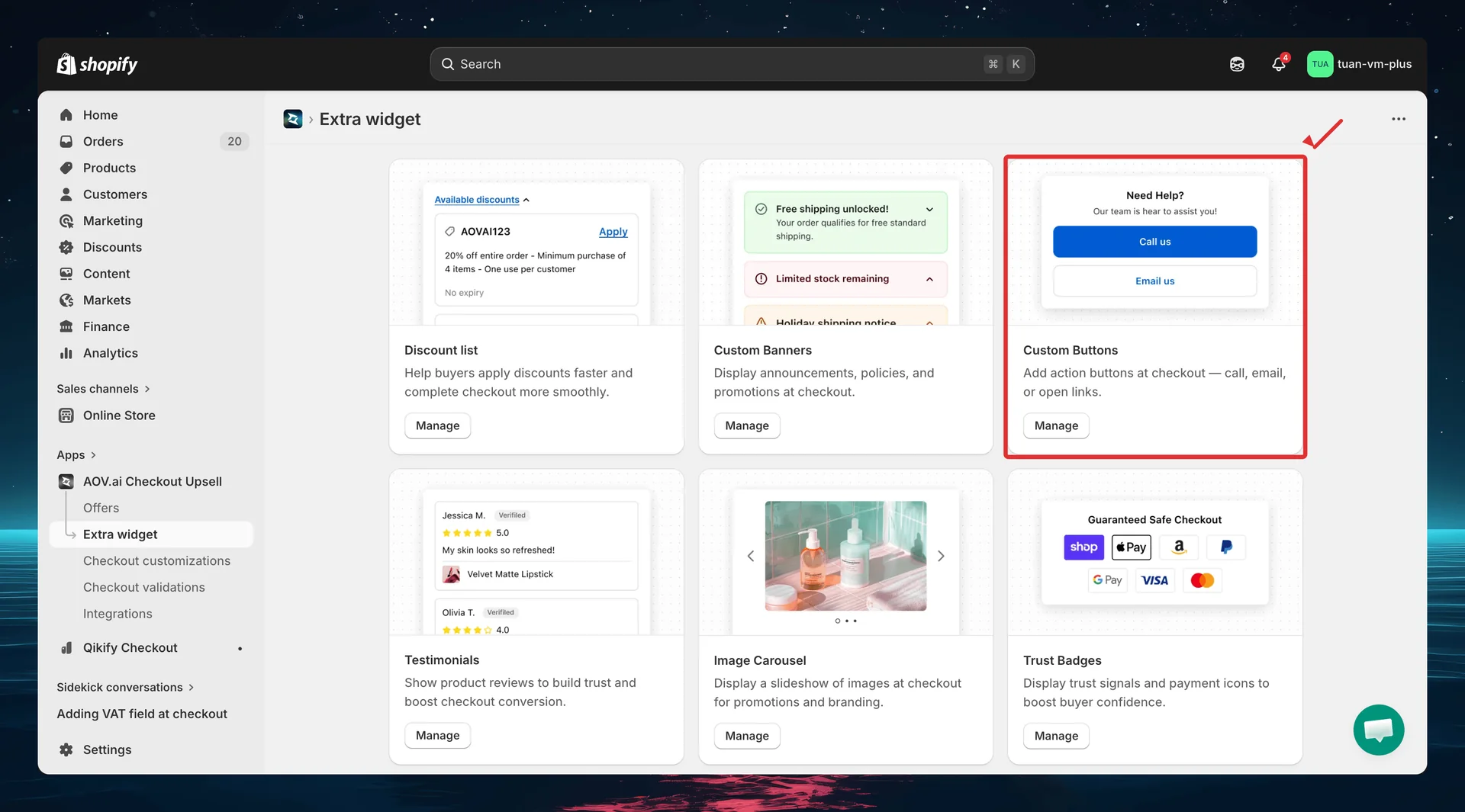
Custom Buttons
Add action buttons at checkout — call, email, or open links. Custom Buttons let buyers reach support, read FAQs, or contact your team without leaving the checkout flow.
Requires Shopify Plus. Custom Buttons uses Checkout UI Extensions, which are available on Shopify Plus plans.
What it does
Custom Buttons displays a group of action buttons at your Shopify checkout. Each button can:
- Click to call — tap to dial a phone number directly
- Open link — open a URL in a new tab (FAQ page, policy page, chat link)
- Send email — open the email client with a pre-filled address
Buttons support three visual styles (Primary/Secondary/Plain), icons from 75 built-in Shopify checkout icons, and horizontal or vertical layouts. Each button group gets a unique Widget ID for placement in the Theme Editor.
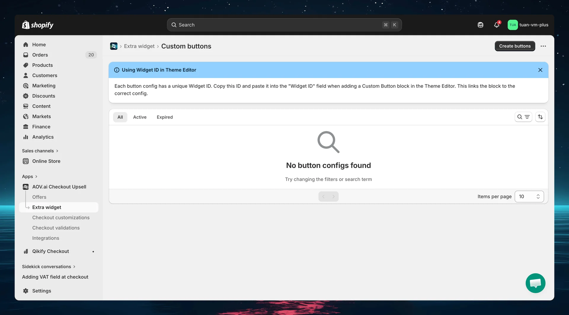
Step 1: Go to Extra Widgets
In the app sidebar, click Extra widget. Find the Custom Buttons card and click Manage.
Step 2: List page overview
The list page shows all your custom button configs.
| Column | Description |
|---|---|
| Widget ID | Auto-generated unique ID — copy and use in Theme Editor |
| Name | Config name for your reference (not shown to buyers) |
| Status | Active or Expired |
| Layout | Horizontal or Vertical |
| Created | Date the config was created |
| Actions | Activate/Deactivate, Edit, Delete |
You can select multiple configs and use bulk actions to activate, deactivate, or delete them at once.
Each button config has a unique Widget ID. Copy this ID and paste it into the "Widget ID" field when adding a Custom Buttons block in the Theme Editor.
Step 3: Create a new button group
Click Create buttons (top right). The editor opens with a two-column layout: settings on the left and sidebar + live preview on the right.
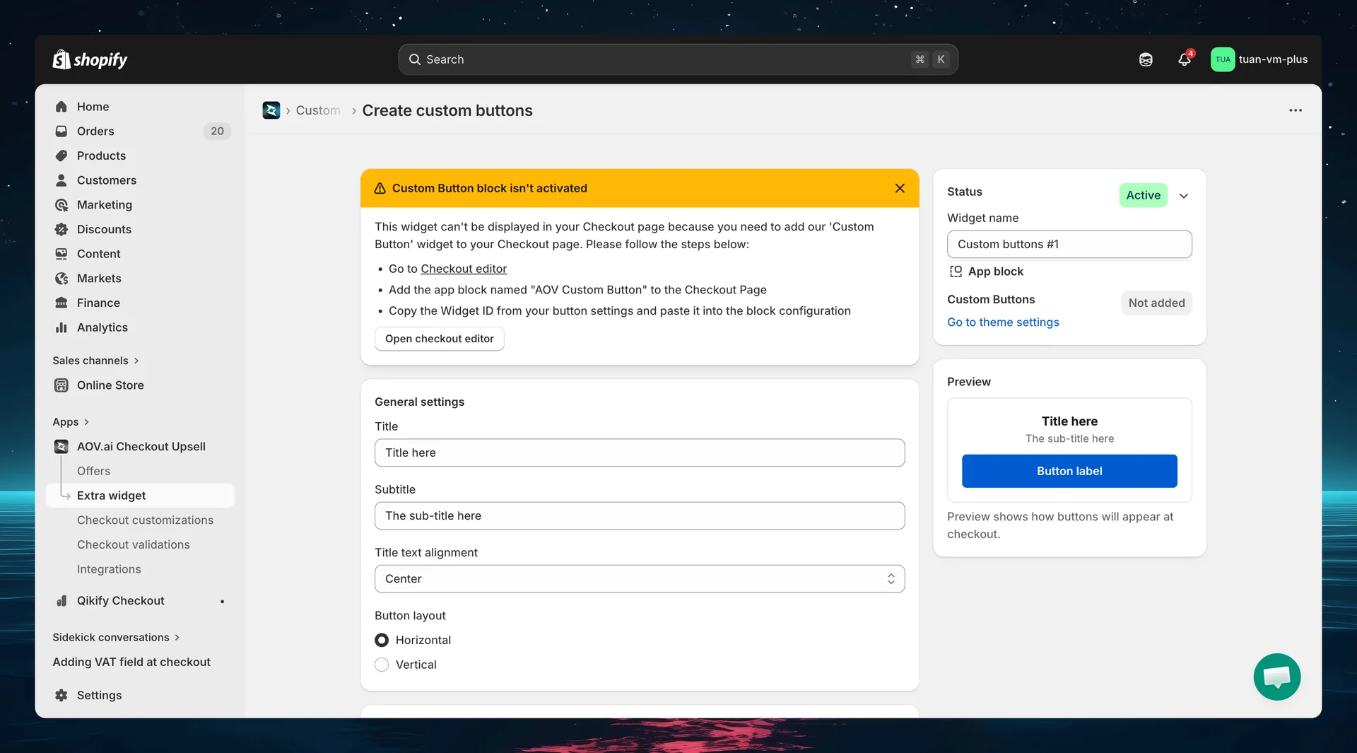
Widget ID
After saving for the first time, a Widget ID is generated and displayed at the top of the editor. Use this ID when adding the button block in the Theme Editor.
General settings
| Setting | Options | Default | Description |
|---|---|---|---|
| Title | Free text | "Title here" | Heading displayed above the buttons |
| Subtitle | Free text | "The sub-title here" | Secondary text below the title |
| Title text alignment | Left / Center / Right | Center | Alignment of the title and subtitle |
| Button layout | Horizontal / Vertical | Horizontal | How buttons are arranged |
- Horizontal — buttons side by side in equal-width columns. Best for 2–3 buttons.
- Vertical — buttons stacked full-width. Best for 4+ buttons or long labels.
Step 4: Configure buttons
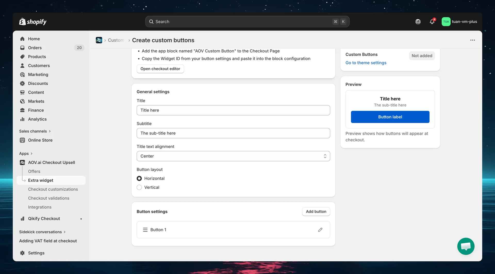
The Button settings section lets you add, edit, delete, and reorder buttons. Click Add button to add a new button. Each button appears as an expandable row that you can drag to reorder.
Click the edit icon (pencil) on a button to open the configuration modal.
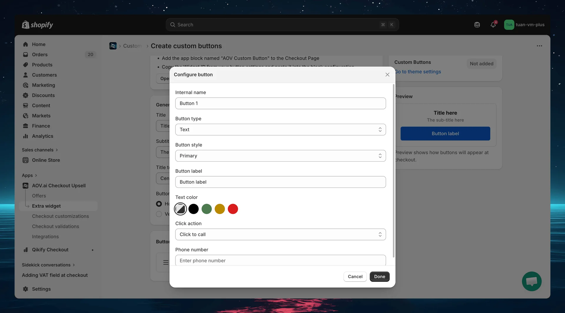
Per-button settings
Basic info
| Setting | Description |
|---|---|
| Internal name | Name for your reference (e.g., "Call Support"). Required — validated before save |
Button content
| Setting | Options | Default | Description |
|---|---|---|---|
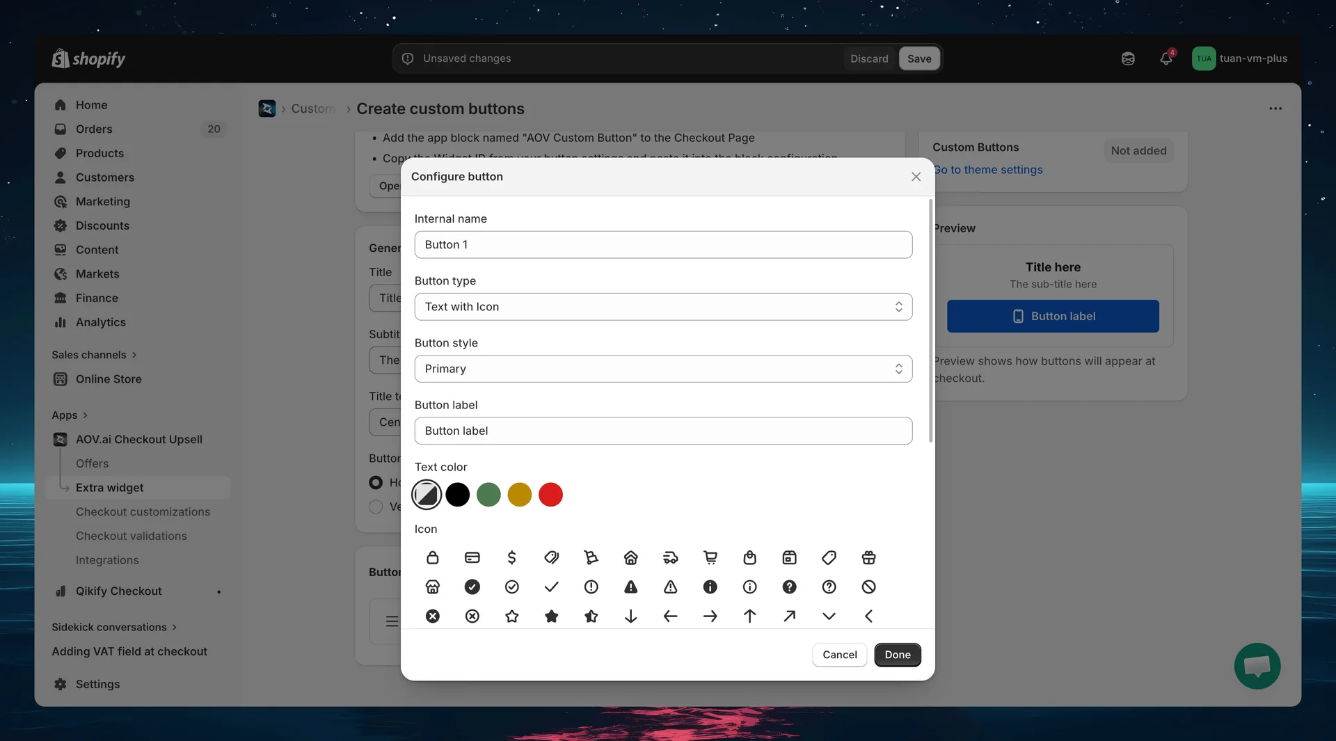
| Button type | Text / Icon / Text with Icon | Text | What the button displays |
| Button style | Primary / Secondary / Plain | Primary | Visual style of the button |
| Button label | Free text | "Button label" | Text shown on the button (when type includes text) |
Button styles:
| Style | Appearance | Best for |
|---|---|---|
| Primary | Filled background, contrasting text | Main CTA — "Call Us", "Get Help" |
| Secondary | Outlined / bordered, no fill | Secondary actions — "FAQ", "Email Us" |
| Plain | Text-only link style, no border or fill | Low-emphasis actions — "Learn more" |
Icon settings (when type is Icon or Text with Icon)
| Setting | Description |
|---|---|
| Icon | Visual grid picker with 75 Shopify checkout icons, with a "Search icons…" field to filter by name |
| Icon color | 5 color swatches: Auto, Info, Success, Warning, Critical |
Popular icons: mobile (phone), email, external (link), globe, chat, info, store.
Icon colors may be overridden by the button style — icons inside a filled Primary button typically render in the contrasting button text color. The color setting has the most effect on Secondary and Plain buttons.
Text color (when type includes text)
| Setting | Options | Description |
|---|---|---|
| Text color | Auto / Info / Success / Warning / Critical | Override the button label color. "Auto" uses the default button text color |
Click action
| Setting | Options | Description |
|---|---|---|
| Click action | Click to call / Open link / Send email | What happens when the button is clicked |
Depending on the action, an additional field appears:
| Action | Field | Example |
|---|---|---|
| Click to call | Phone number | +1 800 000 0000 |
| Open link | URL | https://example.com/faq |
| Send email | Email address | [email protected] |
Step 5: Sidebar settings
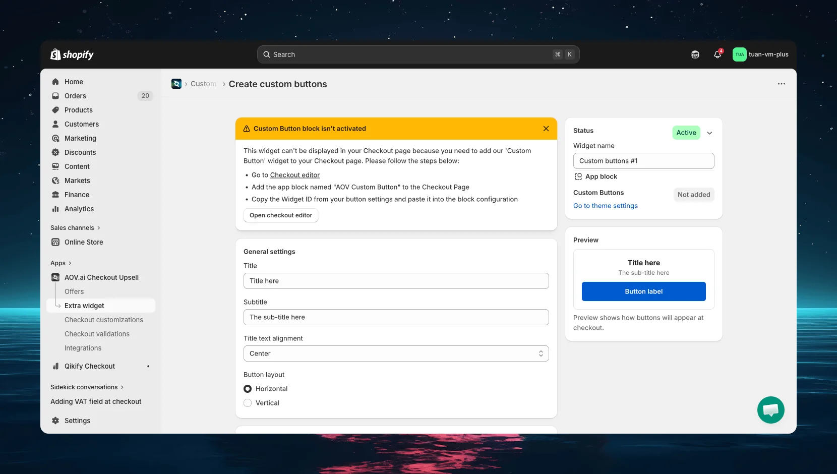
The right column of the editor shows status controls and a live preview.
| Section | Description |
|---|---|
| Status | Toggle between Active (live at checkout) and Expired (hidden) |
| Widget name | Name for your reference — not shown to buyers (e.g., "Support Buttons") |
| App block | Shows whether the Custom Buttons block has been added in the Theme Editor. Click "Go to theme settings" to open the Theme Editor |
| Preview | Live preview showing how buttons will appear at checkout. Updates in real-time as you change settings |
The preview uses checkout design tokens (SF Pro font, Shopify blue primary) to accurately represent the checkout appearance.
Step 6: Add the block in Theme Editor
After saving your button config in the app, add it to your checkout page:
- Go to Shopify Admin → Online Store → Customize
- Navigate to the Checkout page in the theme editor
- Click Add block → select AOV Custom Buttons
- In the block settings, enter the Widget ID you copied from the app
- Position the block where you want it (main content area or Order Summary sidebar)
- Click Save in the theme editor
You can add multiple Custom Buttons blocks — each with a different Widget ID — to display different button groups at different positions.
If the Widget ID is invalid or doesn't match any config, the block will be hidden at checkout — it won't break the checkout page.
How it works at checkout
Button display
Buttons render at the position where you placed the block in the Theme Editor. The widget shows:
- Title as a heading (if set)
- Subtitle below the title (if set)
- Buttons arranged in the selected layout (horizontal or vertical)
Button actions
| Action | Behavior |
|---|---|
| Click to call | Opens the phone dialer with the configured number (tel: link) |
| Open link | Opens the URL in a new browser tab |
| Send email | Opens the email client with the configured address (mailto: link) |
Edge cases
| Scenario | Behavior |
|---|---|
| Single button | Always renders full-width regardless of layout setting |
| Widget ID not found | Block hidden, checkout works normally |
| No buttons configured | Widget hidden |
| Horizontal with 4+ buttons | Buttons become very narrow — use Vertical layout instead |
| Extension error | Graceful degradation — checkout works, buttons hidden |
Tips
- Use Primary for the main action — "Call Us" or "Get Help" should stand out with the blue Primary style
- Use Secondary for supporting actions — "FAQ", "Shipping Policy" work well as Secondary buttons
- Keep labels short — under 15 characters for horizontal layout, under 20 for vertical
- Max 3 buttons horizontal — more than 3 becomes too cramped, switch to vertical
- Use Vertical layout in sidebar — the Order Summary column is narrow (~380px), horizontal buttons get squeezed
- Add icons for visual clarity — "Text with Icon" buttons are more scannable than text-only
- Use "Click to call" for mobile buyers — phone buttons are especially effective on mobile checkout
- Test on mobile — verify button layout looks good on smaller screens
FAQs
General
Q: Do I need Shopify Plus for Custom Buttons? A: Yes. Custom Buttons uses Checkout UI Extensions, which require Shopify Plus.
Q: Can I create multiple button configs? A: Yes. Create as many configs as you need — each gets its own Widget ID. Add multiple Custom Buttons blocks in the Theme Editor, each linked to a different config.
Q: What happens if I deactivate a button config? A: It stops appearing at checkout immediately. The config is preserved — you can reactivate it anytime.
Buttons
Q: How many buttons can I add per config? A: There's no hard limit. However, we recommend 2–4 buttons for the best layout. Too many buttons clutter the checkout.
Q: Can I reorder buttons? A: Yes. Drag and drop buttons in the Button settings section to change their order.
Q: What icons are available? A: 75 Shopify checkout icons covering categories such as Security (lock, credit card), Delivery (truck, delivered), Shopping (cart, bag), Status (check, info, alert), and more. Use the "Search icons…" field in the icon picker to filter by name.
Q: Does the icon color work inside buttons? A: Icon color can be overridden by the button style — a filled Primary button renders icons in its contrasting text color regardless of the color setting. The color setting has the most effect on Secondary and Plain buttons.
Theme Editor
Q: Where should I place the Custom Buttons block? A: Common placement is the Order Summary sidebar — buyers can see support options while reviewing their order. You can also place it in the main content area near the payment form.
Q: Can I add the same Widget ID to multiple blocks? A: Yes, but it will show the same buttons in multiple places. For different button groups at different positions, create separate configs.
Q: The block shows nothing at checkout — why? A: Check that the Widget ID matches an active config, the config has at least one button, and the block is saved in the Theme Editor.