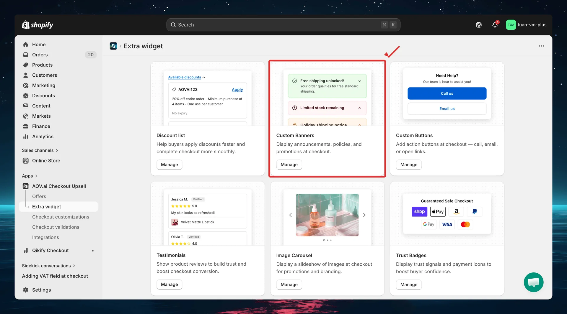
Custom Banners
Display custom announcements, policies, and promotions at checkout. Custom Banners let you show targeted messages — shipping info, return policies, sale announcements — right where buyers make their purchase decision.
Requires Shopify Plus. Custom Banners uses Checkout UI Extensions, which are available on Shopify Plus plans.
What it does
Custom Banners displays customizable notification banners at your Shopify checkout. Each banner has:
- 4 banner styles — Info (blue), Success (green), Warning (yellow), Critical (red) — each with a matching icon and background color.
- Rich text messages — support for bold, italic, strikethrough, bullet lists, and hyperlinks.
- Close & collapse buttons — optionally let buyers dismiss or minimize the banner.
- Trigger conditions — show banners only when specific conditions are met (cart value, products, customer tags).
- Scheduling — set start and end dates to automatically show/hide banners.
Each banner config gets a unique Widget ID. You enter this ID in the Theme Editor when adding a Custom Banner block — linking the block to the correct config.
Step 1: Go to Extra Widgets
In the app sidebar, click Extra widget. Find the Custom Banners card and click Manage.
Step 2: List page overview
The list page shows all your custom banner configs.
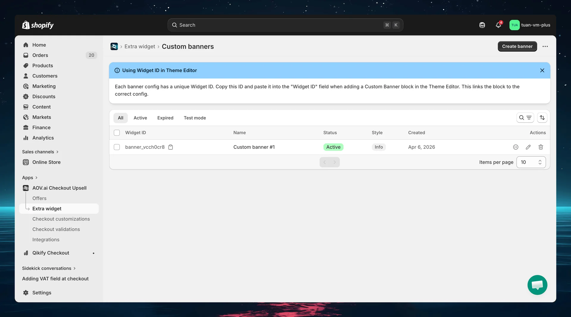
| Column | Description |
|---|---|
| Widget ID | Auto-generated unique ID (e.g., banner_xx0x) — copy and use in Theme Editor |
| Name | Config name for your reference (not shown to buyers) |
| Status | Active, Expired, or Test mode |
| Style | Info, Success, Warning, or Critical |
| Created | Date the config was created |
| Actions | Activate/Deactivate, Edit, Delete |
You can select multiple configs and use bulk actions to activate, deactivate, or delete them at once.
Each banner config has a unique Widget ID. Copy this ID and paste it into the "Widget ID" field when adding a Custom Banner block in the Theme Editor. This links the block to the correct config.
Step 3: Create a new banner
Click Create banner (top right). The editor opens with a two-column layout: settings on the left and sidebar + live preview on the right.
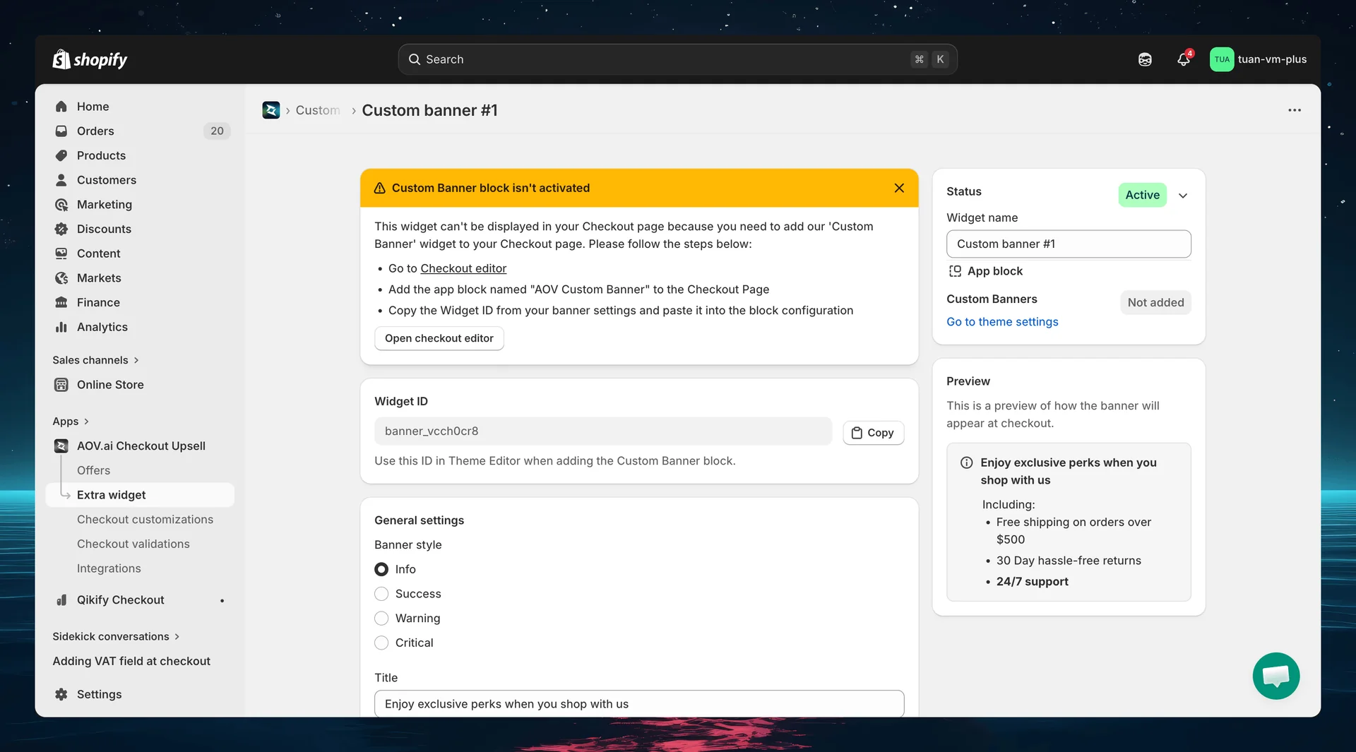
Widget ID
After saving for the first time, a Widget ID is generated and displayed at the top of the editor. Use this ID when adding the banner block in the Theme Editor.
General settings
Banner style
Choose from 4 Shopify banner styles:
| Style | Color | Best for |
|---|---|---|
| Info | Blue | General information, shipping policies |
| Success | Green | Promotions, positive announcements |
| Warning | Yellow | Important notices, limited-time alerts |
| Critical | Red | Urgent messages, restrictions |
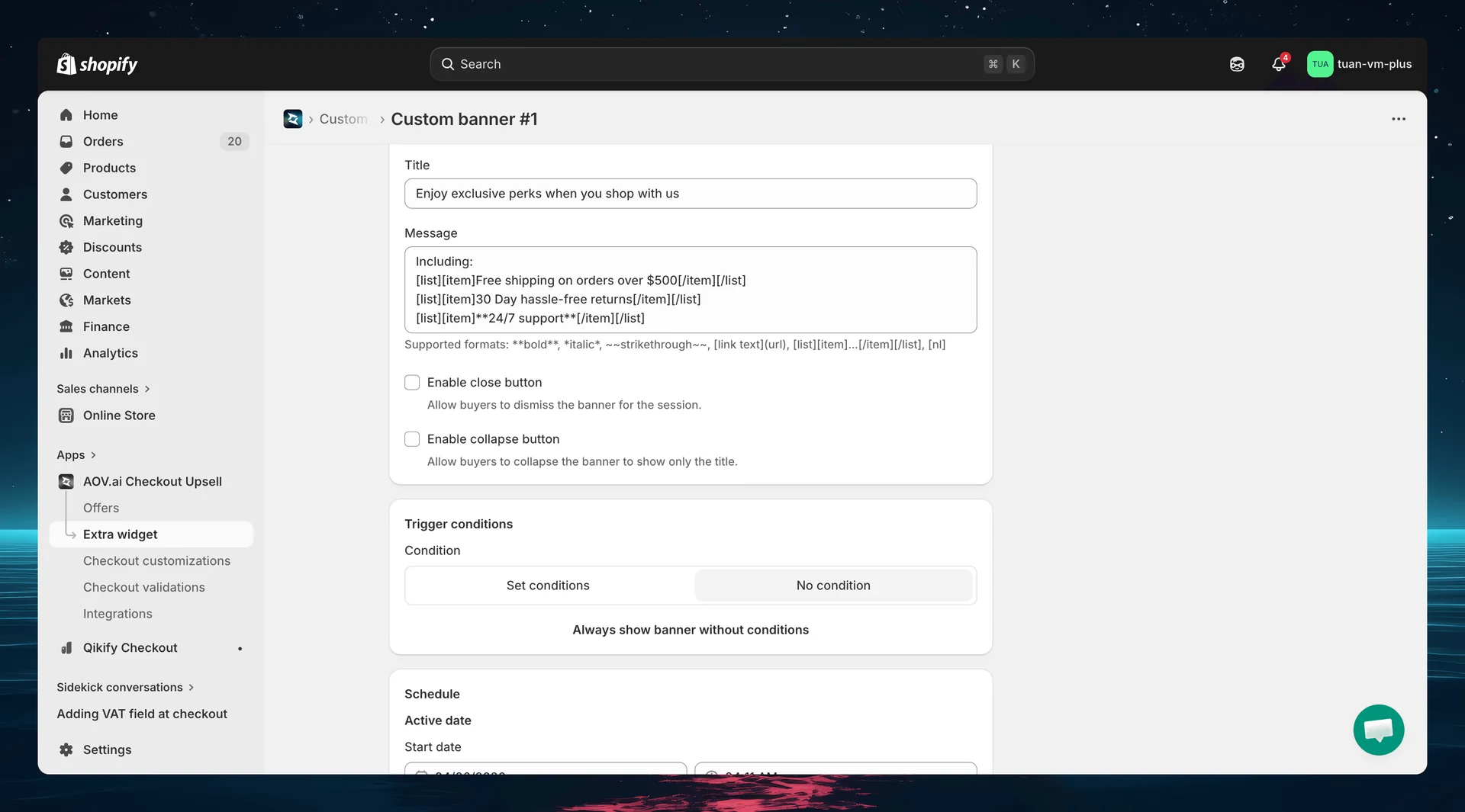
Title & Message
| Field | Description |
|---|---|
| Title | Banner heading (optional) — displayed in bold above the message |
| Message | Banner body — supports rich text formatting |
Supported rich text formats:
**bold**for bold text*italic*for italic text~~strikethrough~~for strikethrough[link text](url)for hyperlinks[list][item]text[/item][/list]for bullet lists[nl]to insert a line break
The field hint under the Message box lists the same supported formats: **bold**, *italic*, ~~strikethrough~~, [link text](url), [list][item]...[/item][/list], [nl].
Close & collapse buttons
| Setting | Description | Default |
|---|---|---|
| Enable close button | Buyers can dismiss the banner for the session | Off |
| Enable collapse button | Buyers can collapse the banner to show only the title | Off |
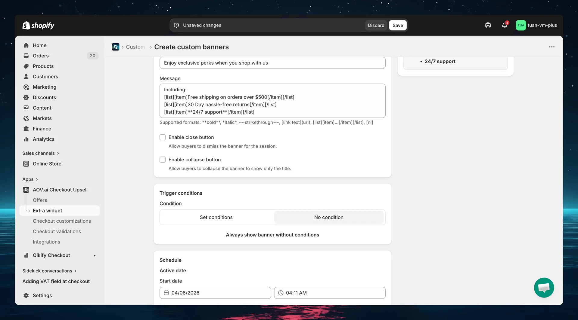
Step 4: Set trigger conditions (optional)
Control when the banner appears using trigger conditions. By default, the banner shows for all buyers.
Toggle between two modes:
| Mode | Description |
|---|---|
| No condition | Banner always shows for all buyers (shows the message "Always show banner without conditions") |
| Set conditions | Banner only shows when ALL conditions are met (AND logic) |
Available conditions
| Condition | Description |
|---|---|
| Included product (or variant) | Cart must contain specific products or variants |
| Excluded product (or variant) | Cart must NOT contain specific products or variants |
| Subtotal value | Cart subtotal meets a threshold. Comparators: Greater (>), Greater or equal (≥), Less (<), Less or equal (≤), Equal (=), or a range ("Use a range") |
| Customer tag | Buyer must have (Include) or not have (Exclude) specific customer tags |
| Shipping country | Buyer's shipping country is in (Include) or not in (Exclude) the selected list of countries |
The condition picker groups these under Product, Order, Customer, and Shipping sections. You can add up to 5 conditions (each condition type can be used once). All conditions use AND logic — click "+ Add 'AND' condition" to add another. Every condition must be true for the banner to appear.
For guest checkout (no customer account), customer tag conditions are skipped — the banner still shows.
Step 5: Set schedule (optional)
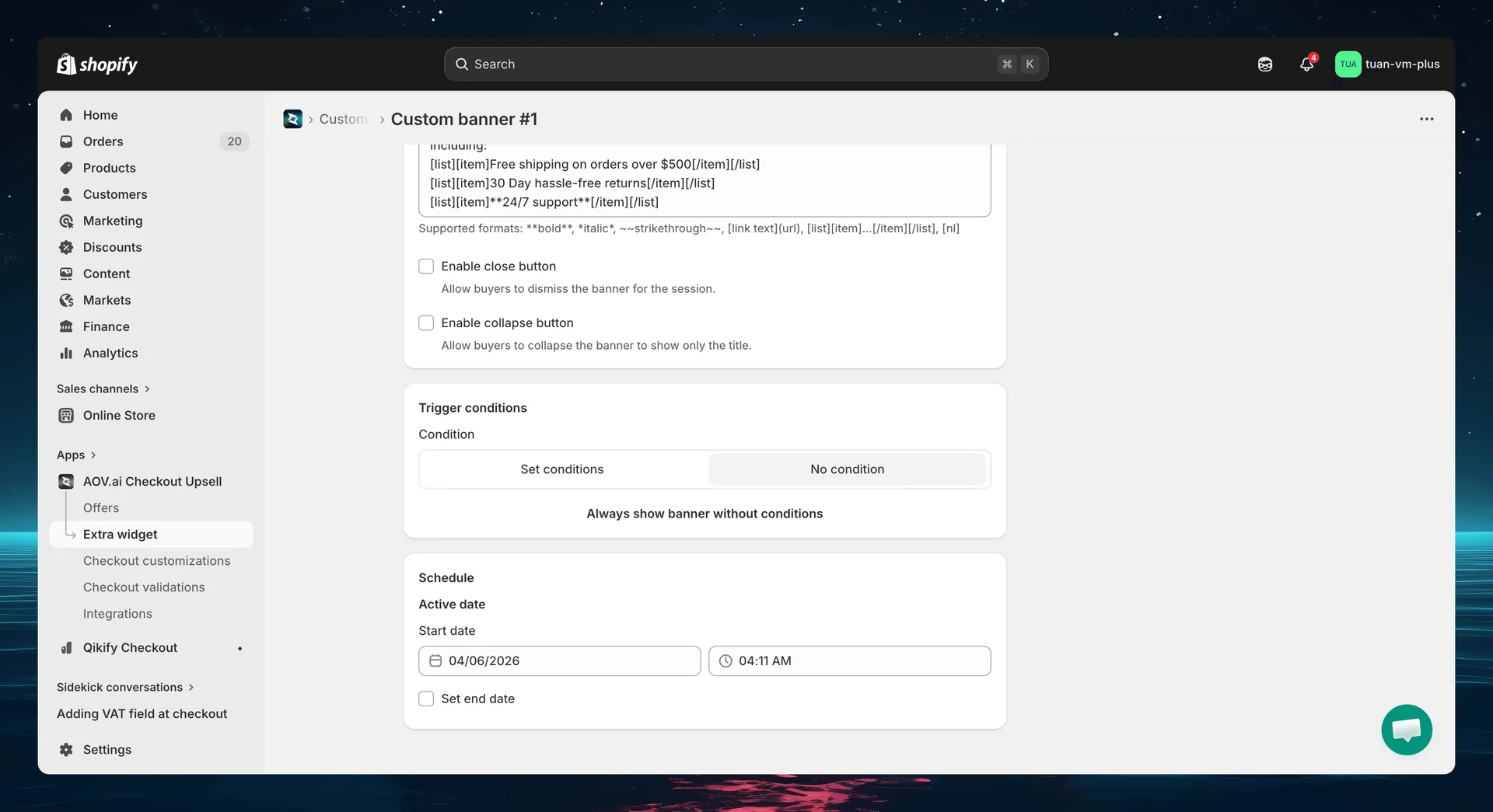
The Schedule section controls when the banner is active.
| Setting | Description |
|---|---|
| Active date / Start date | When the banner becomes active |
| Set end date | Check to set an end date — uncheck for no expiry |
Banners outside their scheduled period are automatically hidden — no need to manually deactivate them.
Step 6: Sidebar settings
The right column of the editor shows status controls and a live preview.
| Section | Description |
|---|---|
| Status | Toggle between Active (live at checkout), Expired (hidden), or Test mode (only shows for [email protected]) |
| Widget name | Name for your reference — not shown to buyers |
| App block | Shows whether the Custom Banner block has been added in the Theme Editor. Click "Go to theme settings" to open the Theme Editor |
| Preview | Live preview showing how the banner will look at checkout. Updates in real-time as you change settings |
Step 7: Add the block in Theme Editor
After saving your banner config in the app, add it to your checkout page:
- Go to Shopify Admin → Online Store → Customize
- Navigate to the Checkout page in the theme editor
- Click Add block → select AOV Custom Banner
- In the block settings, enter the Widget ID you copied from the app
- Position the block where you want it (main content area or Order Summary sidebar)
- Click Save in the theme editor
You can add multiple Custom Banner blocks — each with a different Widget ID — to display different banners at different positions on the checkout page.
If the Widget ID is invalid or doesn't match any config, the block will be hidden at checkout — it won't break the checkout page.
How it works at checkout
Banner display
Each active banner that matches conditions and is within schedule appears at the position where you placed the block in the Theme Editor. The banner shows:
- Style icon on the left (matching the selected banner style)
- Title in bold (if set)
- Message content with rich text formatting
- Collapse chevron (if collapse is enabled) — click to toggle between expanded and collapsed states
- Close button (if enabled) — click to dismiss the banner for the session
Edge cases
| Scenario | Behavior |
|---|---|
| Banner outside schedule | Hidden automatically |
| Conditions not met | Hidden |
| Test mode | Only shows when checkout email is [email protected] |
| Widget ID not found | Block hidden, checkout works normally |
| Extension error | Graceful degradation — checkout works, banner hidden |
Tips
- Use Info style for policies — the blue background is neutral and informative
- Use Warning/Critical sparingly — they draw strong attention, reserve for important messages
- Keep messages concise — use bullet points for multiple items
- Use scheduling for promotions — set start and end dates for sale banners so they auto-hide
- Test with Test mode — set status to "Test mode" and use
[email protected]at checkout to verify before going live - Use conditions wisely — show free shipping reminders only when cart value is below the threshold
- Place in sidebar for less intrusion — Order Summary sidebar banners are visible but don't interrupt the checkout flow
FAQs
General
Q: Do I need Shopify Plus for Custom Banners? A: Yes. Custom Banners uses Checkout UI Extensions, which require Shopify Plus.
Q: Can I create multiple banner configs? A: Yes. Create as many banners as you need — each gets its own Widget ID. Add multiple Custom Banner blocks in the Theme Editor, each linked to a different config.
Q: What happens if I deactivate a banner? A: It stops appearing at checkout immediately. The config is preserved — you can reactivate it anytime.
Q: What is Test mode? A: When a banner's status is set to "Test mode", it only appears at checkout when the buyer's email is [email protected]. This lets you verify the banner before making it live.
Content
Q: What rich text formatting is supported? A: Bold, italic, strikethrough, hyperlinks, and bullet lists. See the formatting guide in Step 3.
Q: Is there a character limit for the message? A: No hard limit, but keep messages concise. Long messages push other checkout content down.
Q: Can I add images to banners? A: Not currently. Custom Banners support text content only. Images may be added in a future update.
Theme Editor
Q: Where should I place the Custom Banner block? A: Common placements: above the payment form for policies, in the Order Summary sidebar for promotions, or at the top of the checkout page for important announcements.
Q: Can I add the same Widget ID to multiple blocks? A: Yes, but it will show the same banner in multiple places. For different content at different positions, create separate configs with different Widget IDs.
Q: I see a yellow warning about the Custom Banner block — what do I do? A: Follow the instructions: go to the Theme Editor, add the "AOV Custom Banner" block to the Checkout page, enter the Widget ID, and save.