Display setting
Learn how to set up widget content for your Post-purchase upsell offer in AOV.ai Post Purchase.
This step ensures your offers look polished, persuasive, and customer-friendly, helping you maximize additional revenue right after checkout.
Access the Widget editor page directly from the campaign editor. If you've translated this offer, use the language button next to the Desktop/Mobile toggle to preview each translation. See Preview translations in the editor.
How to set up
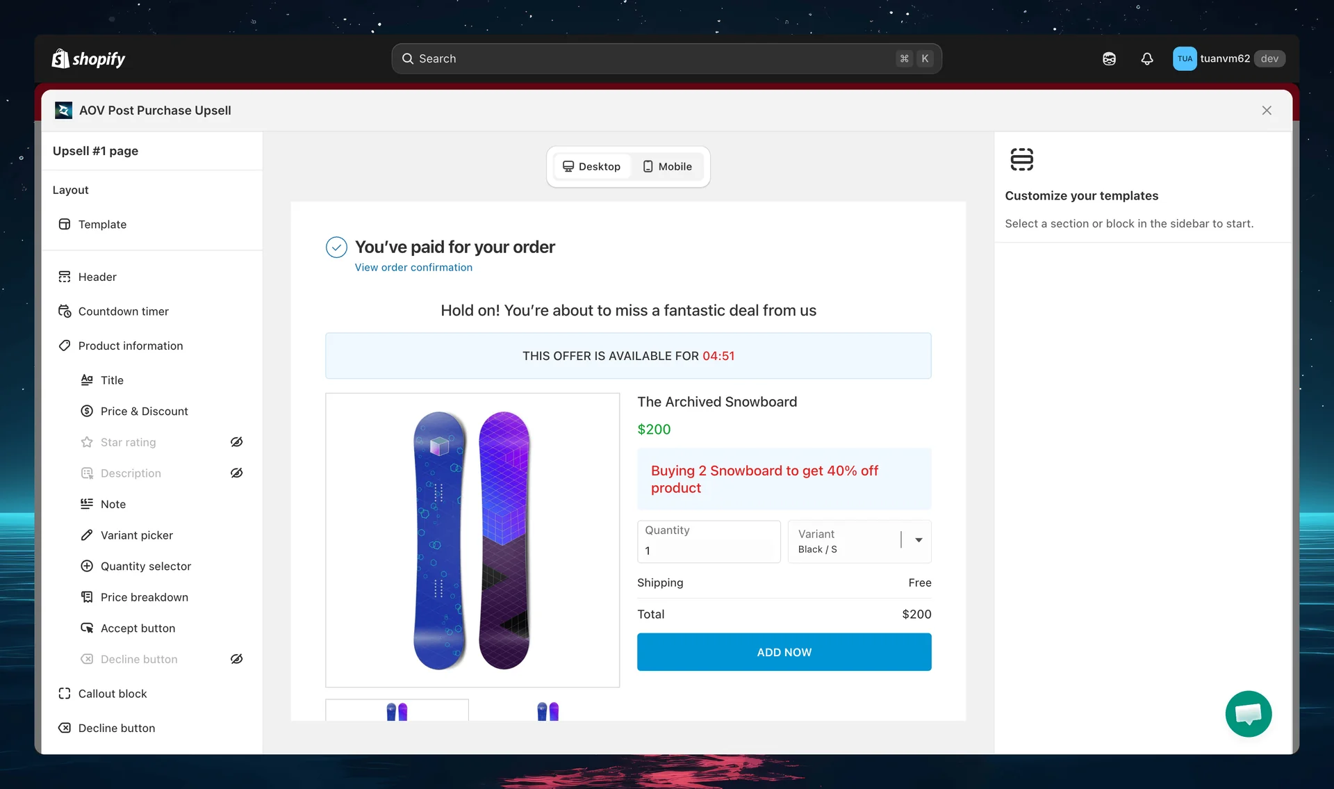
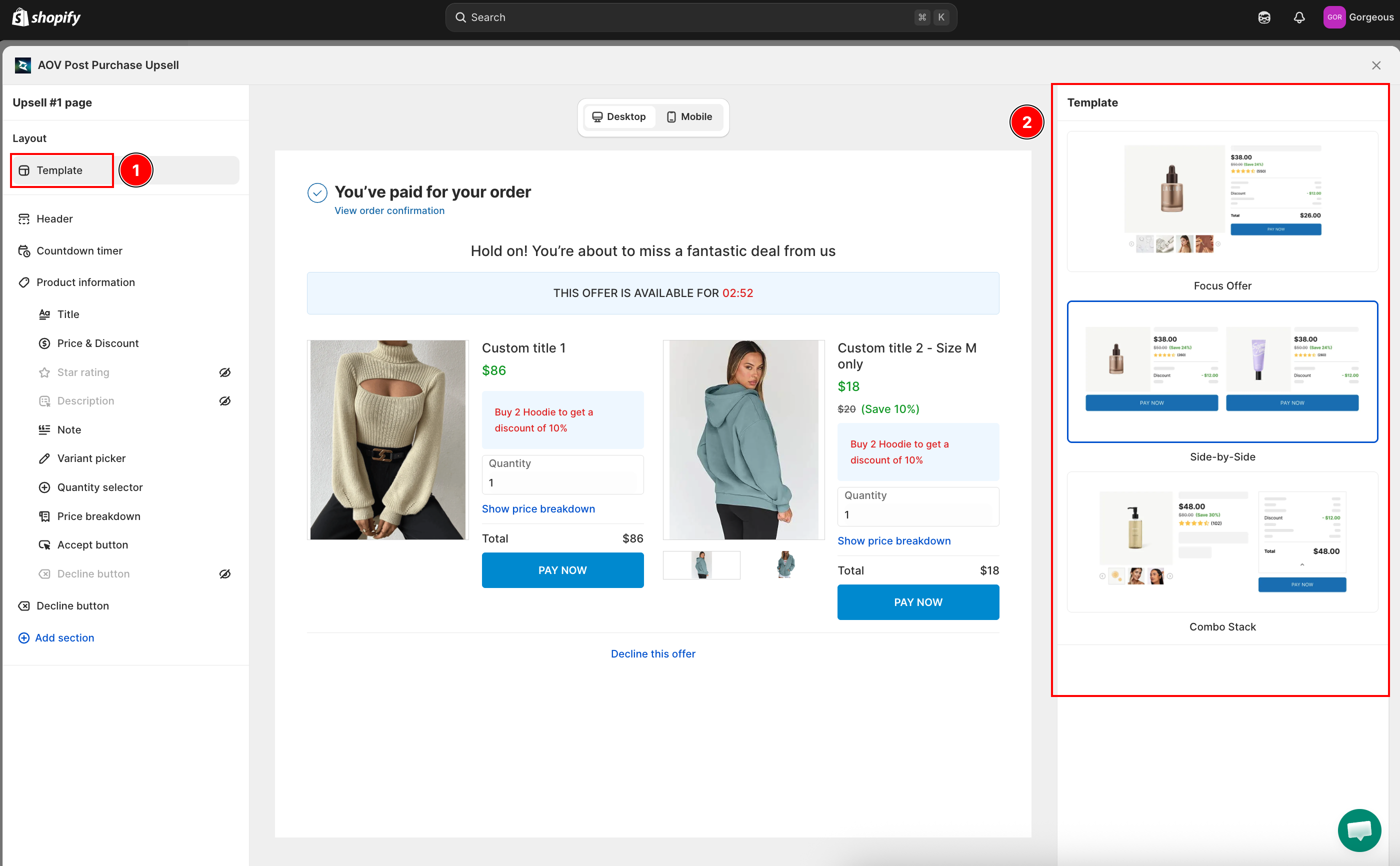
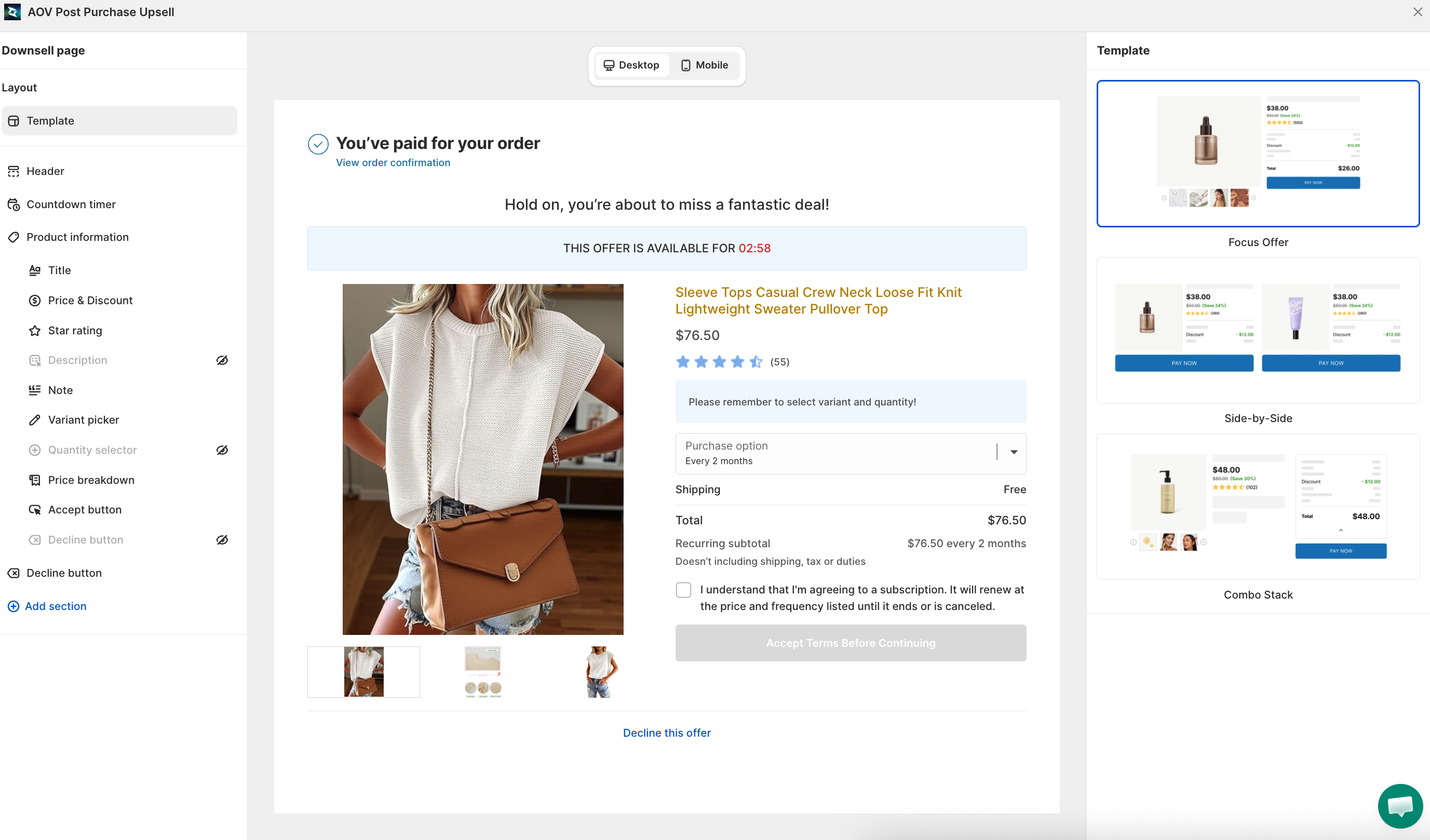
Step 1: Customize Upsell #1 display
The editor panel for each feature appears on the right side after you open it. The preview screen displays in the middle.
-
Select a template: Choose from available layouts (e.g., PPU – Split grid). Use a layout that fits both product image and persuasive text.
-
Add a header text: Keep it concise (max 60 characters). Example: "Hold on! You're about to miss a fantastic deal from us." Use Add variable to personalize with the customer's first name.
-
Countdown timer: Define how long the offer shows (recommended: 3–5 minutes). Shorter times create urgency; longer times give room for decision-making. Contact AOV.ai support to enable a native-friendly timer that adds urgency without conflicting with store themes.
-
Product information: Configure how the product is displayed, including Title, Price & Discount, Star rating, Description, Note, Variant picker, Quantity selector, and Price breakdown.
-
Accept button: Customize the call-to-action button text and style that customers click to add the upsell to their order.
-
Decline button: Customize the button text and style for customers who want to skip the offer.
-
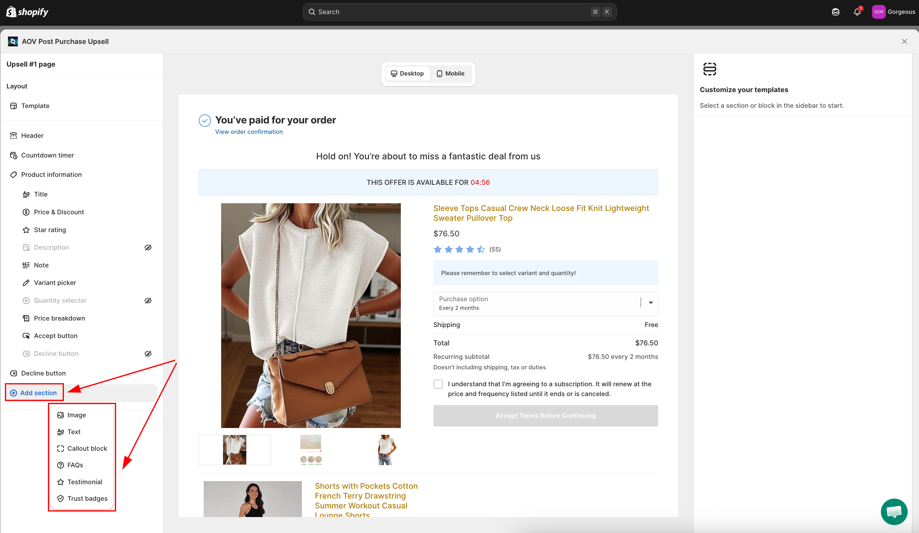
Add section: Add extra content blocks to the offer, including Extra buy button, Image, Text, Callout block, FAQs, Testimonial, and Trust Badges.
Extra buy button
The Extra buy button widget adds a second Accept button that you can drag anywhere in the upsell layout, instead of relying on the single button at the bottom. Placing a buy button right after the hook (price, benefits, reviews) lets customers accept sooner, which lifts the accept rate.
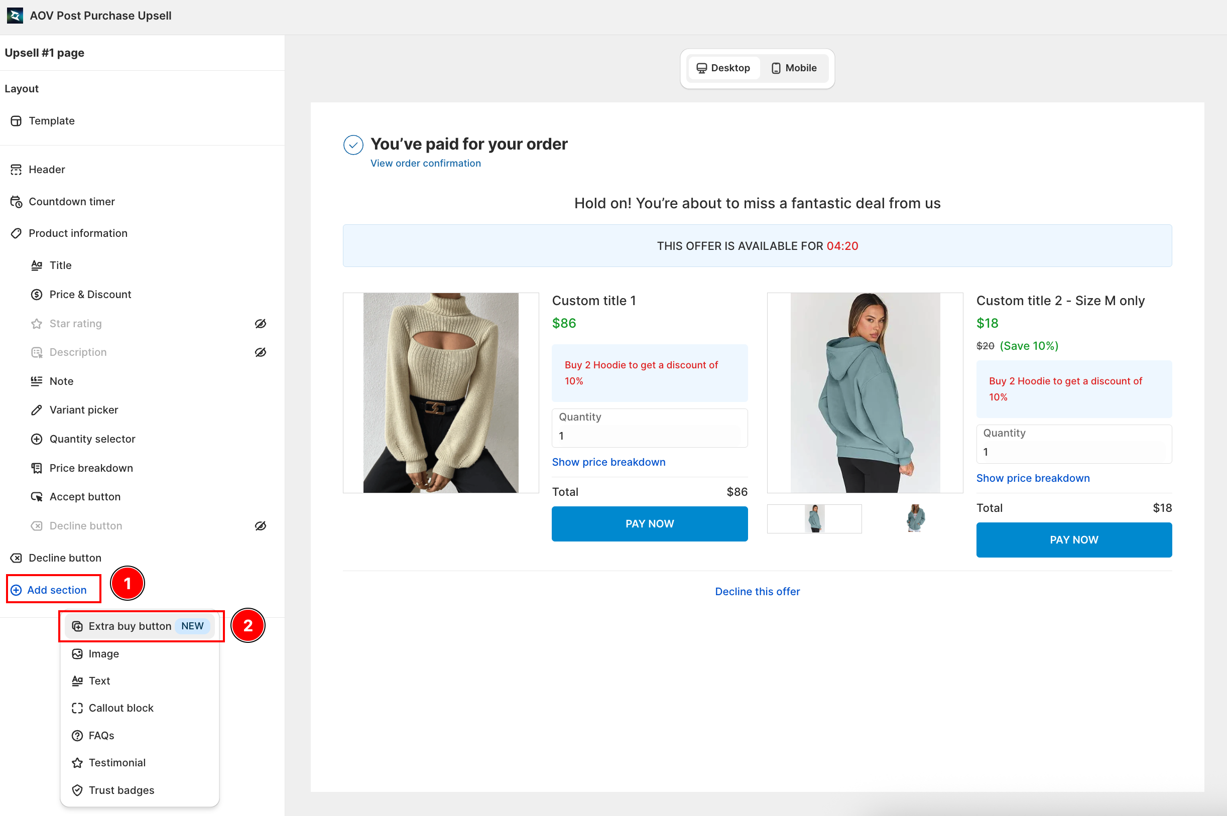
How to add the Extra buy button
- Open the offer in the editor, go to the Sections panel, and click Add section.
- Select Extra buy button (marked NEW) from the list. It appears in the offer preview immediately.
- Drag it to the position you want in the layout.
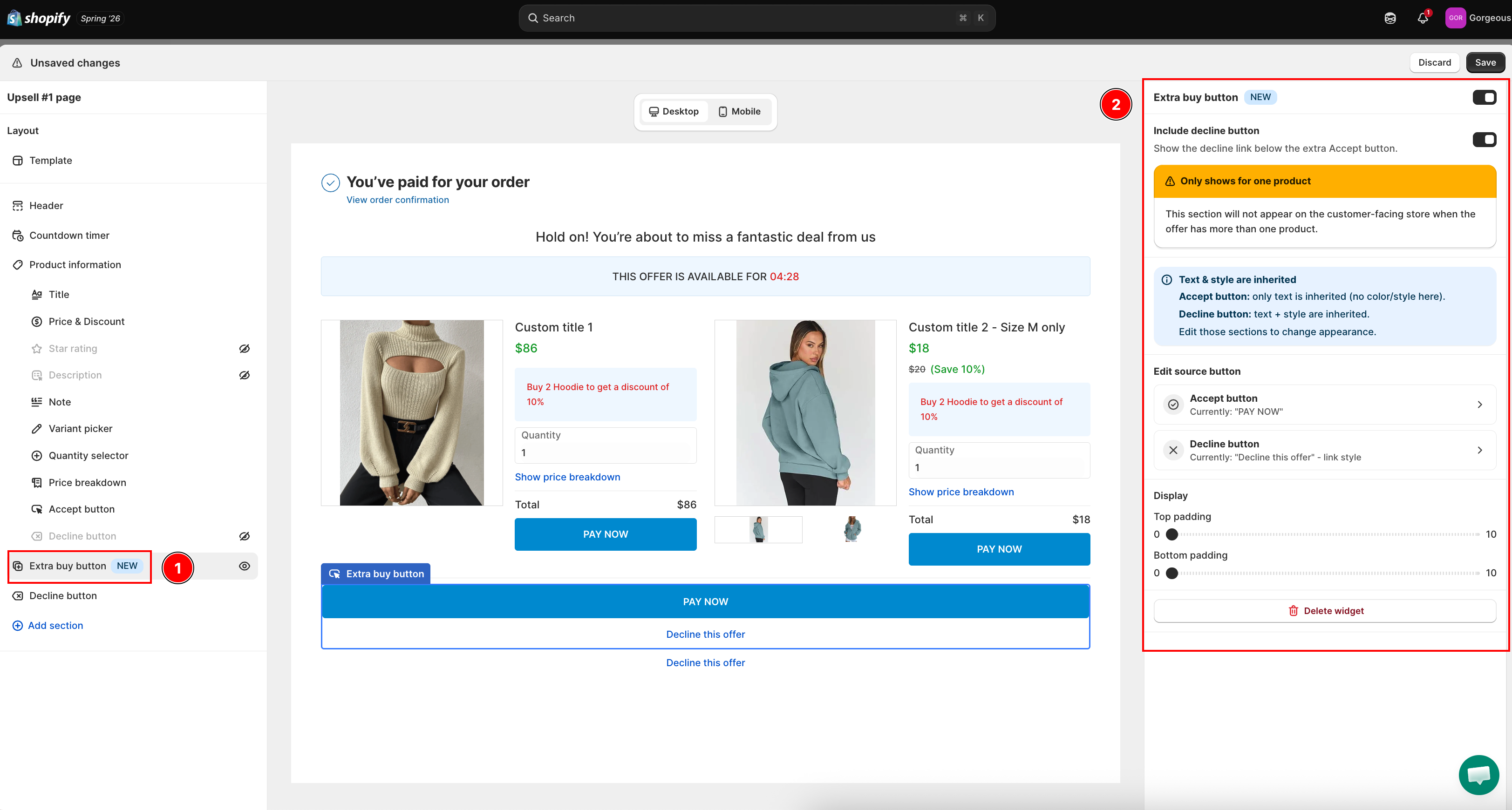
The button inherits its text and style automatically, so there is nothing to re-style:
- Accept button: only the text is inherited (no color or style is set here).
- Decline button: text and style are inherited.
To change the appearance, edit the original Accept button or Decline button sections. The panel has an Edit source button shortcut to jump straight there.
Settings
| Setting | What it does |
|---|---|
| Include decline button | Show the decline link below the extra Accept button. On by default. |
| Padding top / Padding bottom | Adjust the spacing between this button and the widgets next to it. |
Click Save to publish. Changes take effect on your store immediately.
Only shows for one product. The Extra buy button appears on the customer-facing store only when the offer has a single product. If the offer has more than one product, the widget is hidden on the storefront (the editor shows a warning banner).
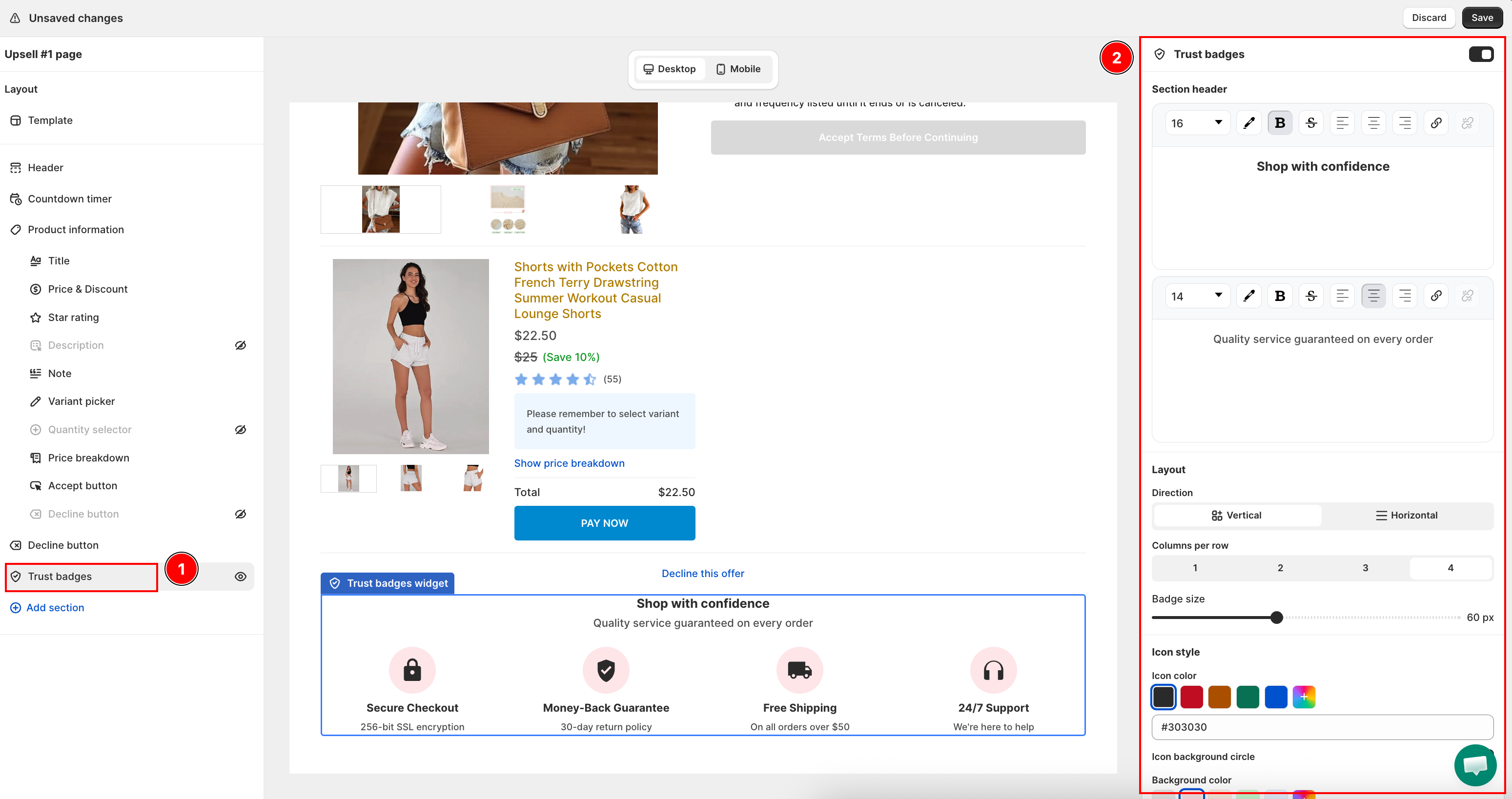
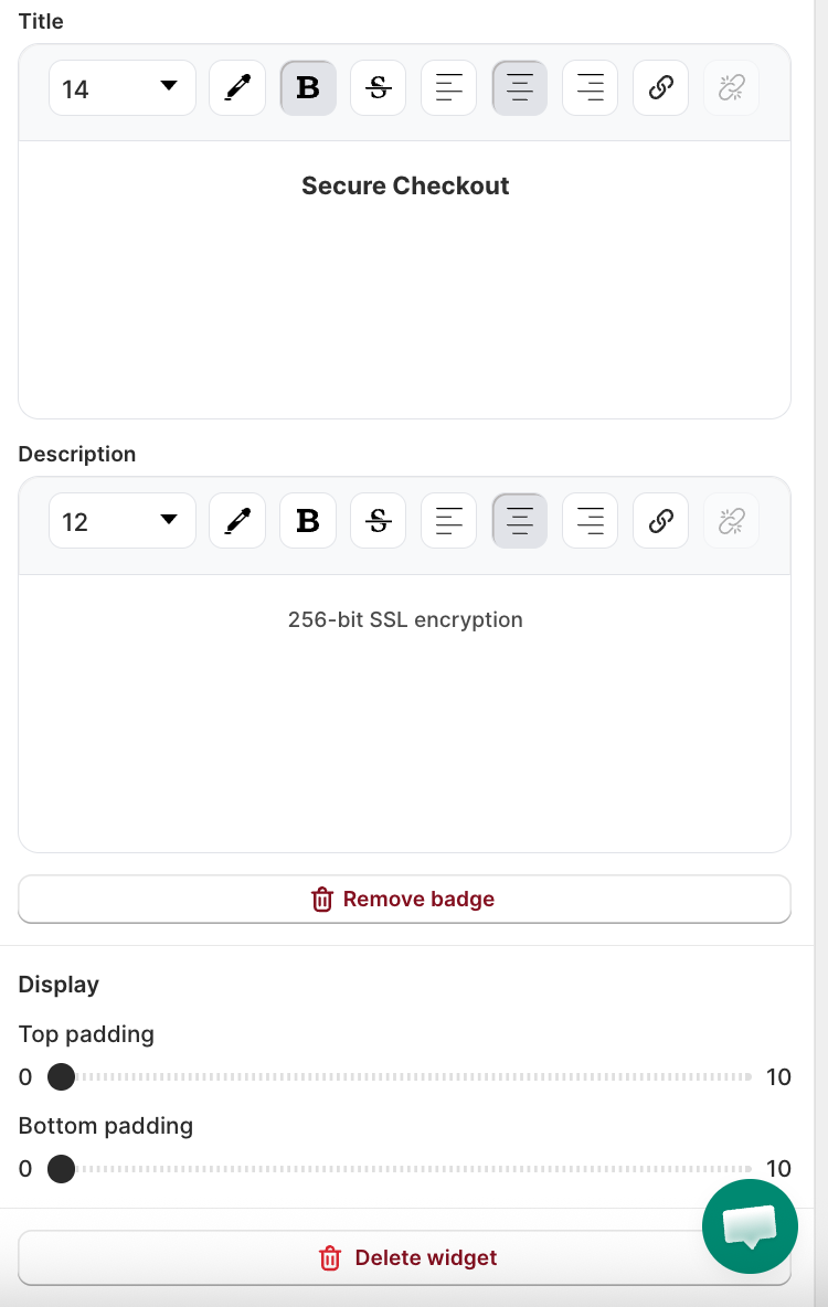
Trust Badges
Trust Badges let you add reassurance signals (secure payment, money-back guarantee, free shipping, and more) directly on your post-purchase offer page. Buyers who just paid often hesitate at a second checkout prompt. A row of trust icons reduces that hesitation and is expected to lift offer acceptance rate.
How to add Trust Badges
- Open the offer in the editor, go to the Sections panel, and click Add section.
- Select Trust Badges from the list. The section appears in the offer preview immediately.
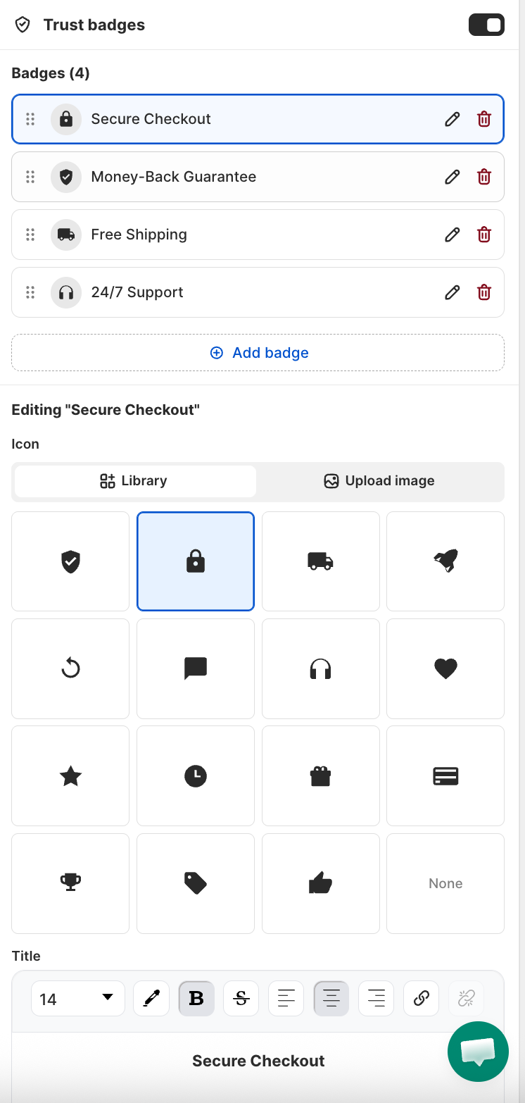
- Click Add badge to insert a badge row. Each badge has three parts:
- Icon: choose from the built-in library (15 icons: Shield, Lock, Truck, Rocket, Refresh, Chat, Headphones, Heart, Star, Clock, Gift, Credit card, Trophy, Tag, Thumbs up) or upload your own image (PNG, JPG, GIF, WEBP, SVG, max 5 MB).
- Title: short label shown below the icon (e.g. "Secure checkout").
- Description: optional second line for extra context (e.g. "256-bit SSL encryption").
- Drag rows to reorder badges. Click the delete icon on any row to remove it.
Layout and style options
| Setting | What it controls |
|---|---|
| Columns | 1-4 columns. Wraps automatically on mobile. |
| Direction | Vertical (icon above text) or Horizontal (icon left of text). |
| Icon color | Applied to all library icons. Includes quick-pick color swatches. |
| Background circle | Toggle on to show a colored circle behind each icon. |
| Background color | Fill color for the circle (shown when background circle is on). |
| Badge size | Scales icon and text proportionally. |
| Text alignment | Align badge text to match your store's brand. |
Click Save after configuring. Badges appear on the live post-purchase page immediately.
For custom images, use square images for the best display. Non-square images may appear cropped or uneven depending on badge size.
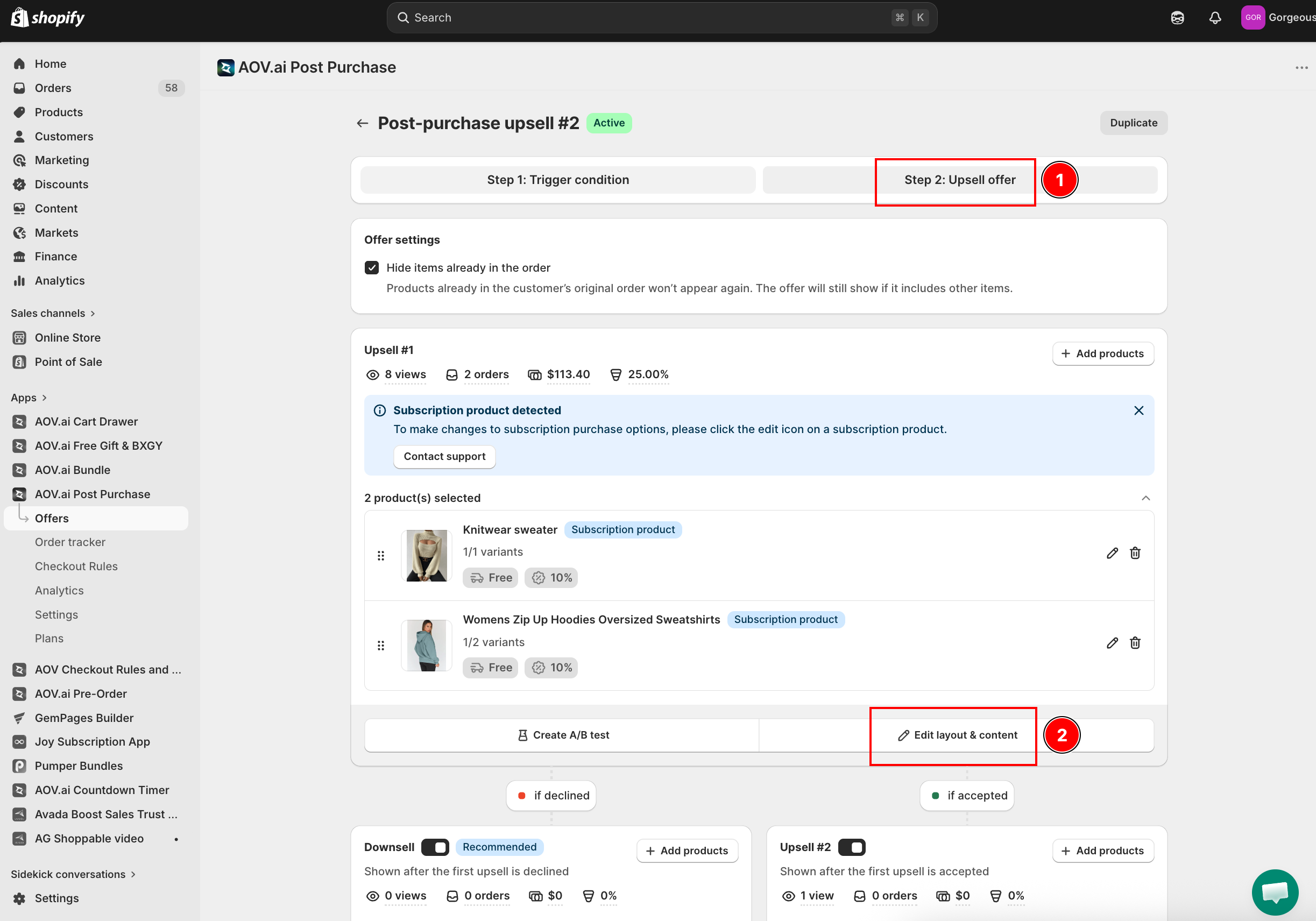
Step 2: Configure Upsell #2 display (optional)
Upsell #2 appears only if enabled. Click Edit layout & content on the Upsell #2 section to open the widget editor.
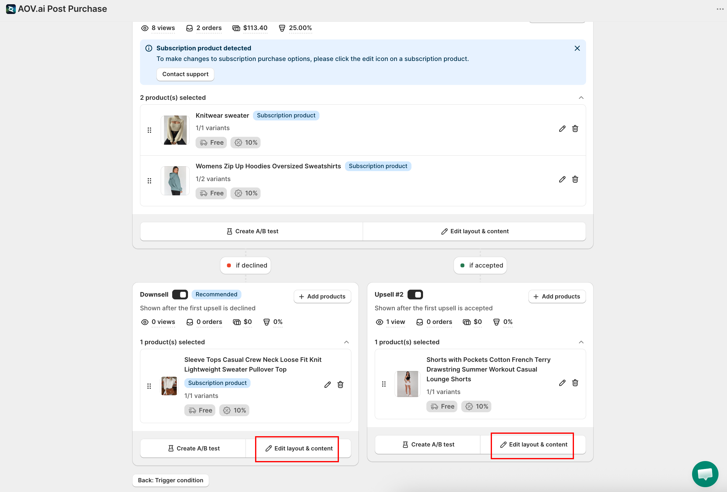
Setup is the same as Upsell #1: select a template, add header text, and set a display duration.
Step 3. Configure Downsell display (optional)
A downsell appears if customers decline both Upsell #1 and Upsell #2.
Follow the same steps: Select a template, add concise header text (e.g., "Wait, here's a smaller deal you'll love."), set display duration (2–3 minutes recommended).
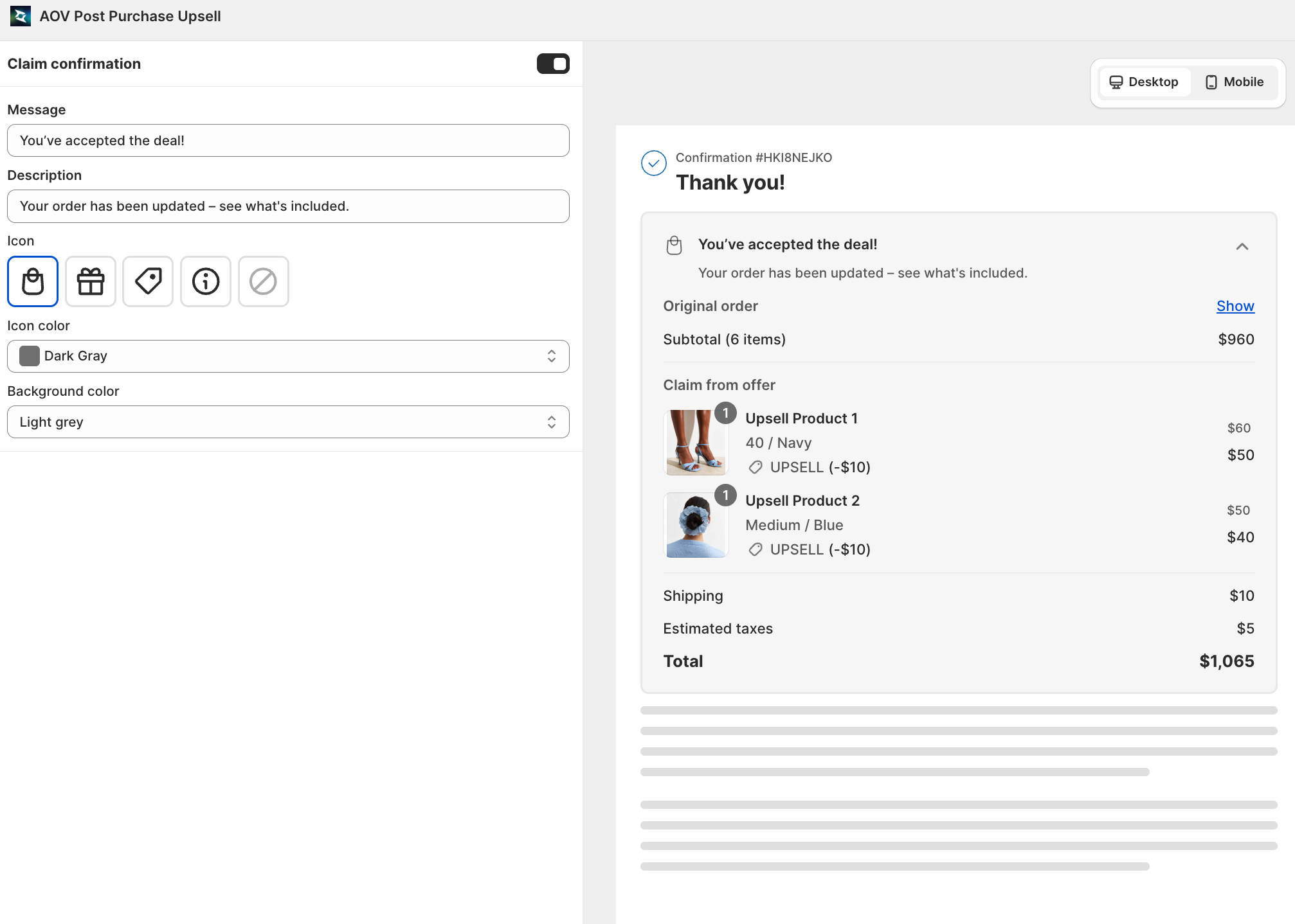
Step 4: Set Claim Confirmation
Enable confirmation to notify customers when their claimed offer is added to their order. This avoids confusion and improves trust.
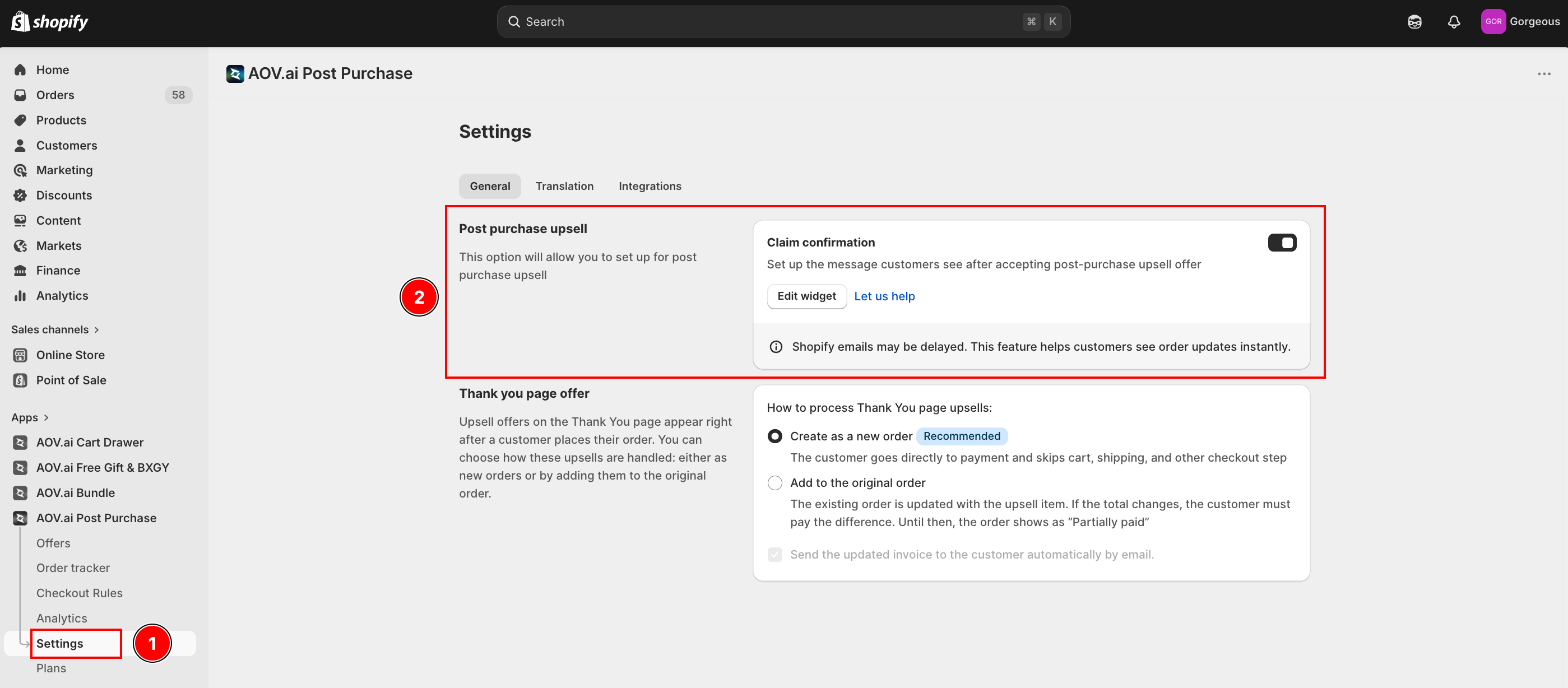
Click Edit widget to customize the text message displayed to customers.
Step 5: Preview your widget and save
- On the right-hand Summary panel, review the offer details.
- Select Preview offer to check exactly how it looks to customers.
- Once satisfying with the setting, hit Save button.